Build Your
Best Day
Build Your
Best Day
Build Your
Best Day
Build Your
Best Day
Build Your
Best Day
A fun way to teach kids about
getting more active.
CLIENT: ParticipACTION
AGENCY: Zulu Alpha Kilo
YEAR: 2017
ROLE: UX & Content Strategy, Copywriter, Creative Director
The world’s first 24-Hour Movement Guidelines were released in June 2016, outlining the recommended amount and intensity of physical activity, limits on sedentary behaviour, and amount and quality of sleep required daily for kids aged 5 to 17.
And based on the statistics, raising awareness and adoption of these guidelines couldn’t be more important. Only 9% of Canadian kids get enough physical activity per day2; only 24% meet guidelines for screen time per day2; and 31% of school-aged kids are sleep-deprived2.
But like most government papers, the 24-Hour Guidelines – in their official form – were too academic, technical and complicated for the average parent or kid to engage with. And with a primary KPI of 12% awareness, finding a better way to get the Guidelines out into the world was vital.
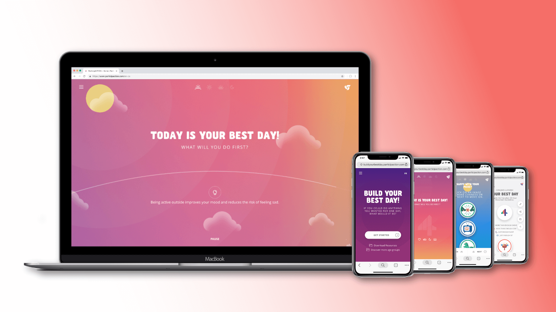
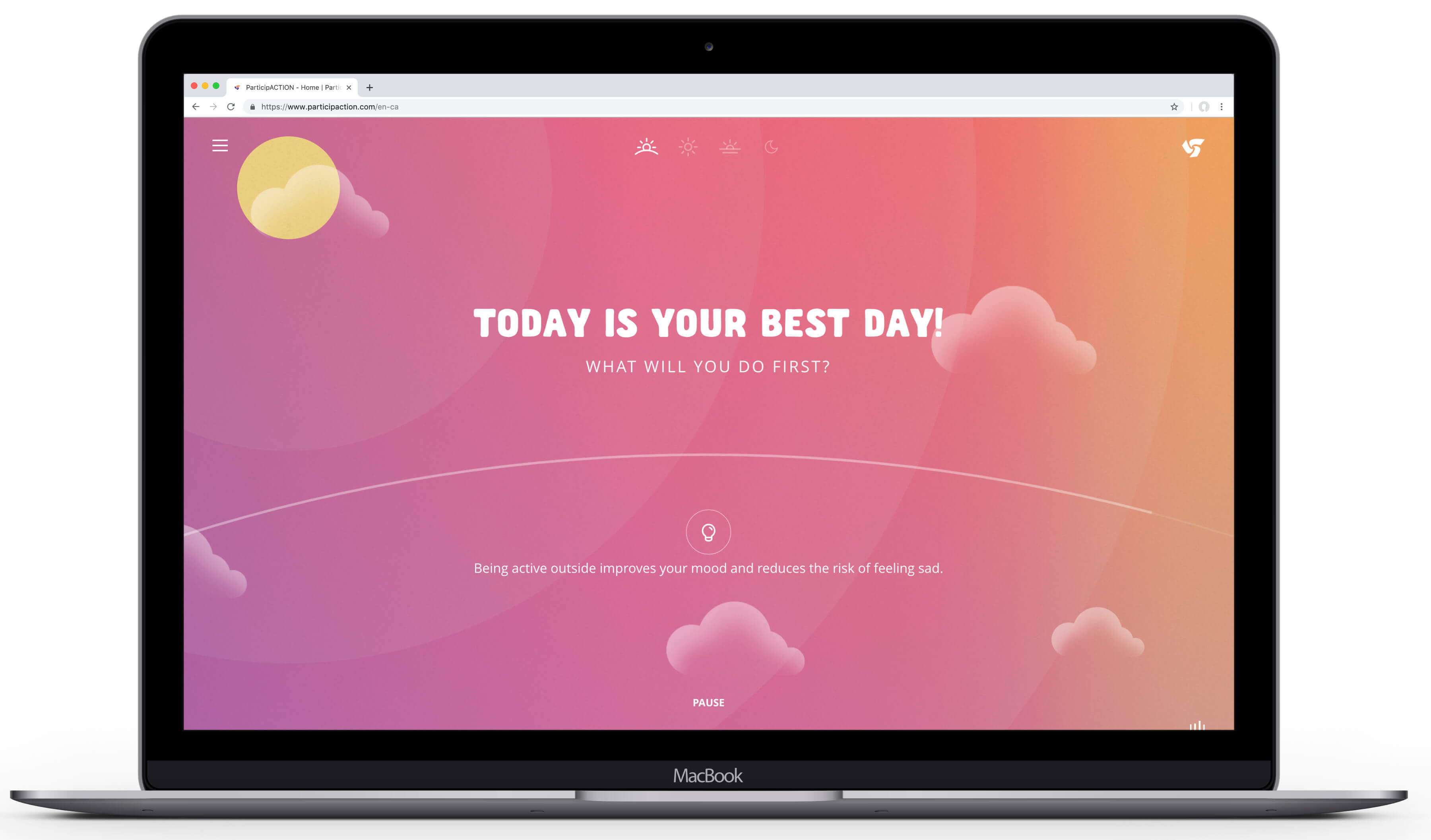
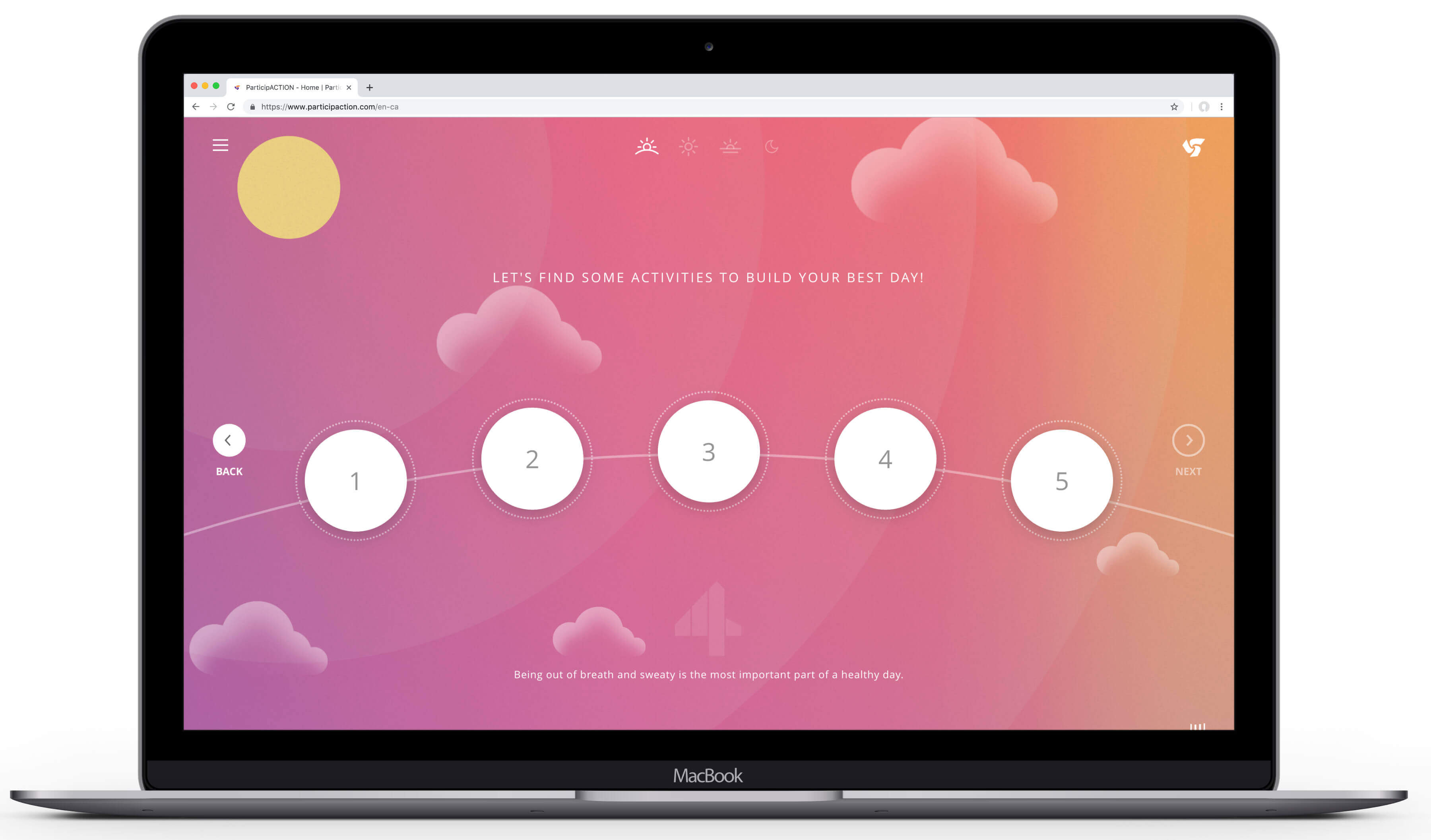
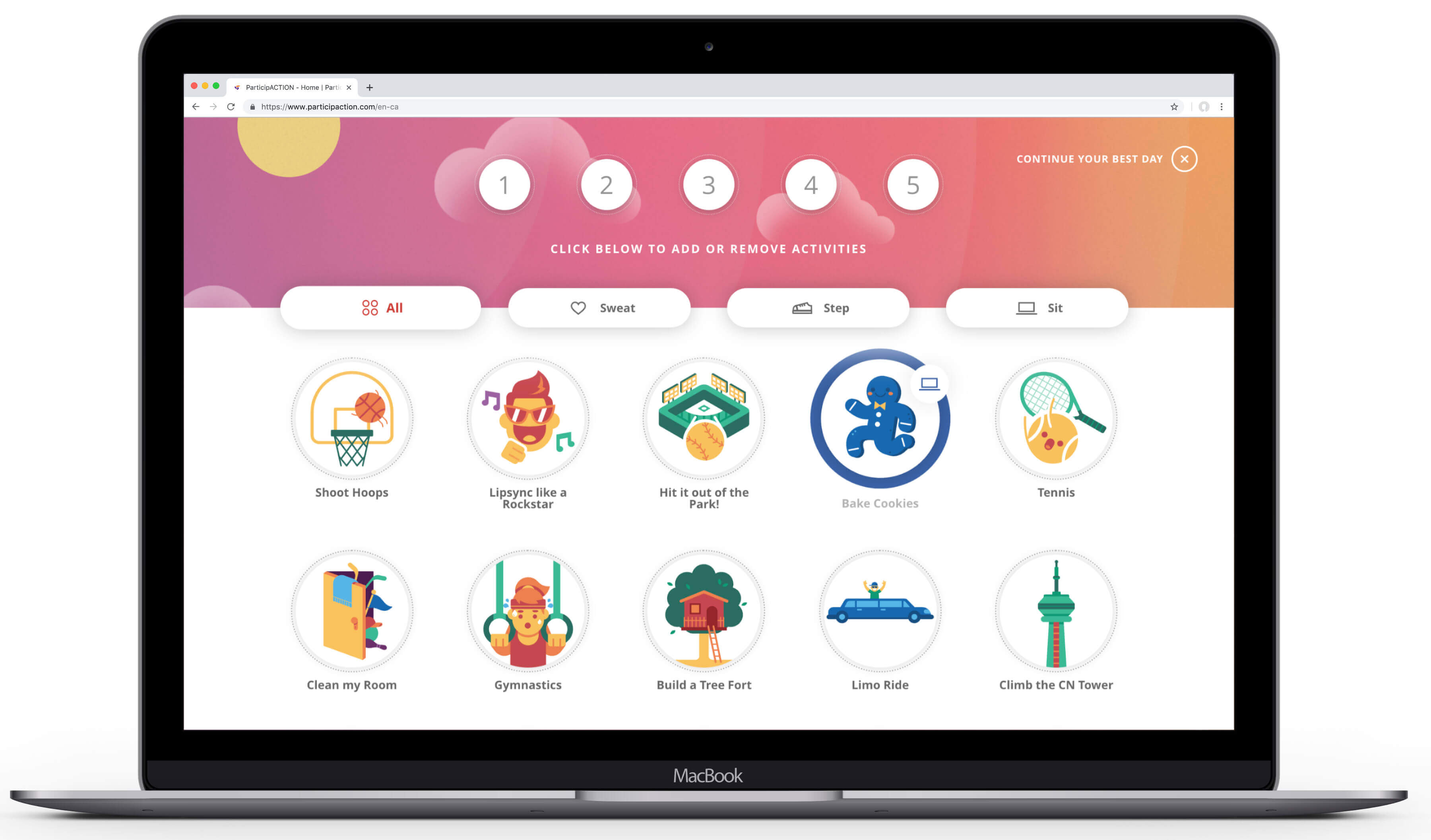
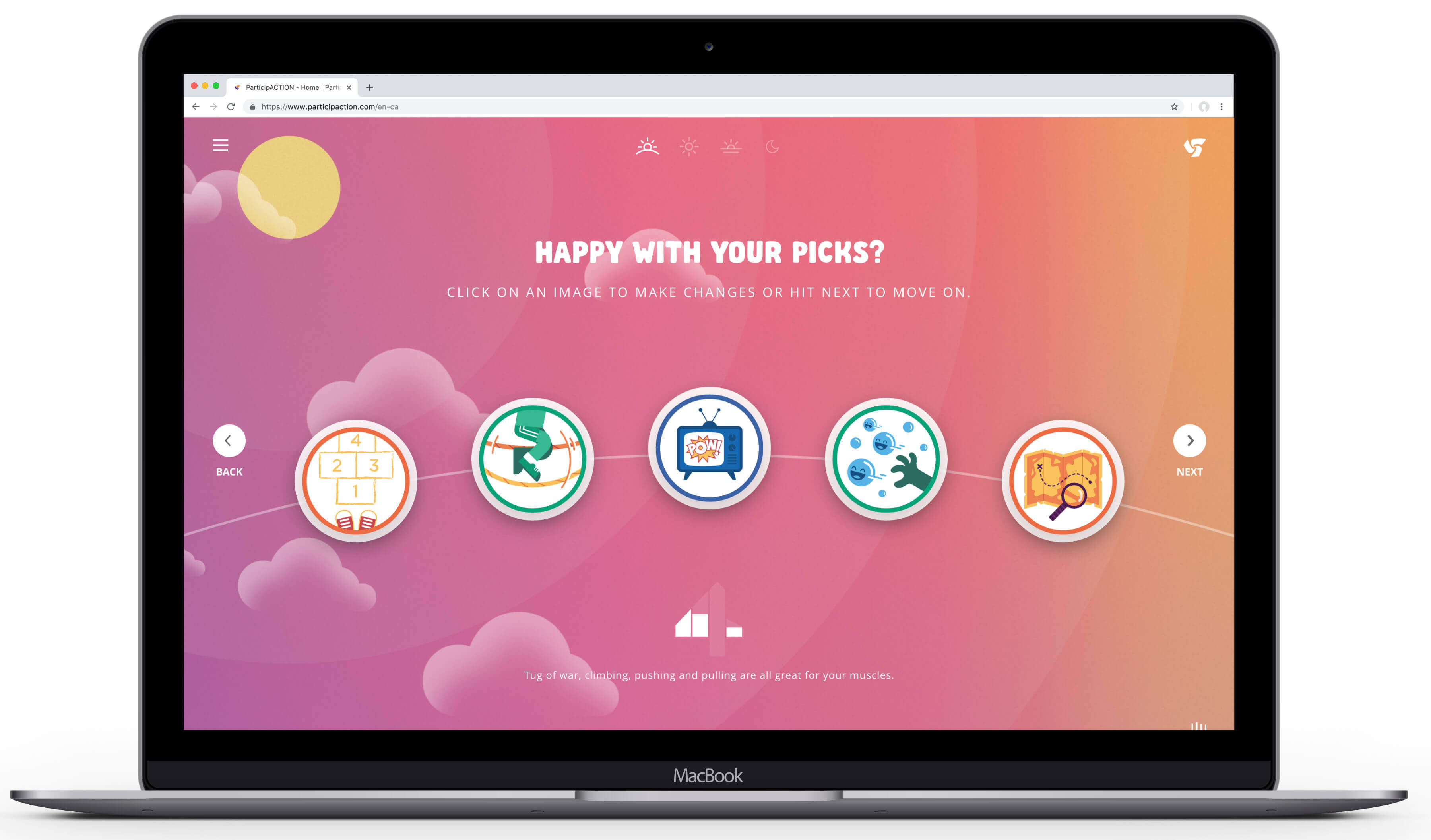
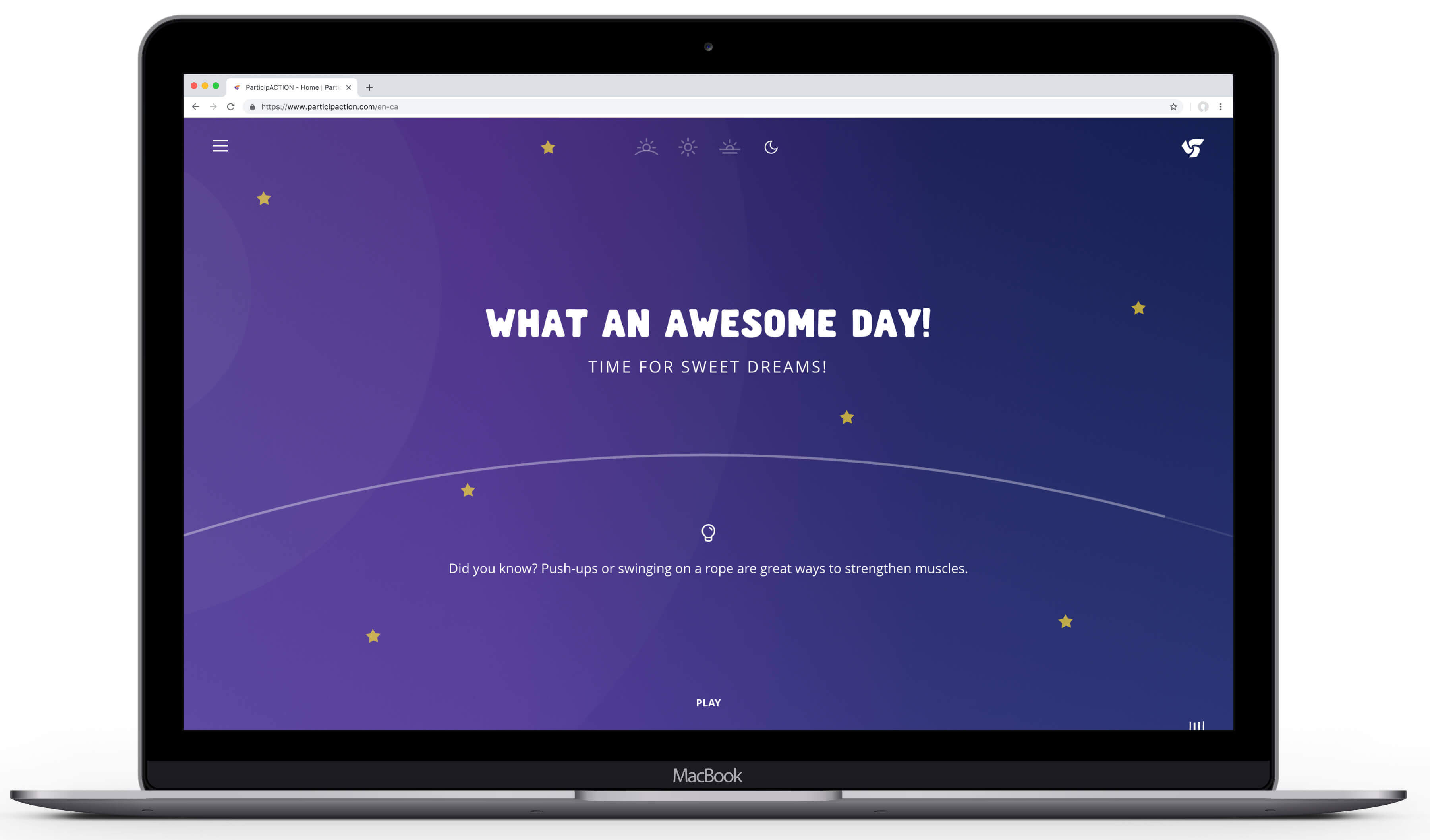
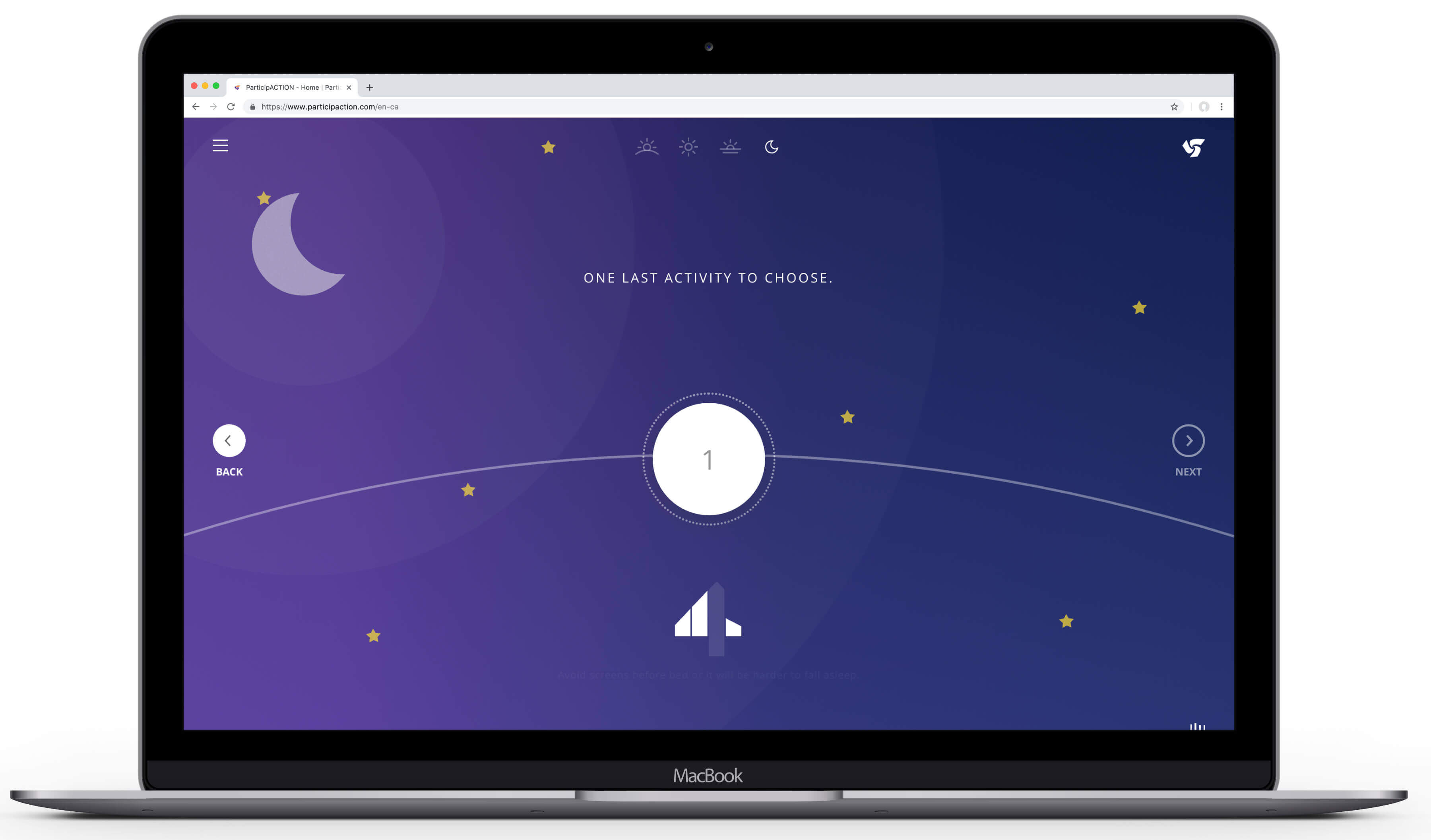
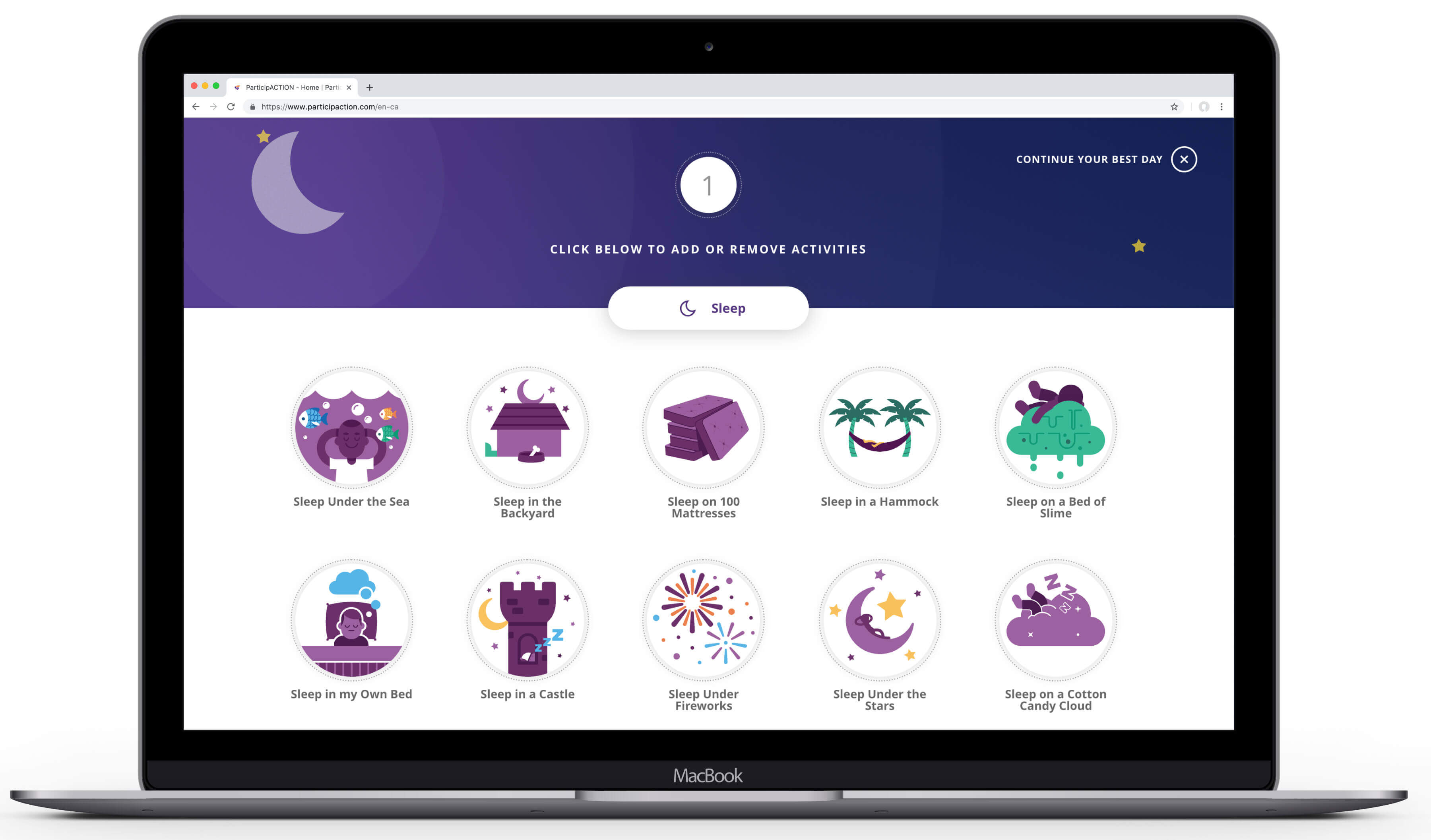
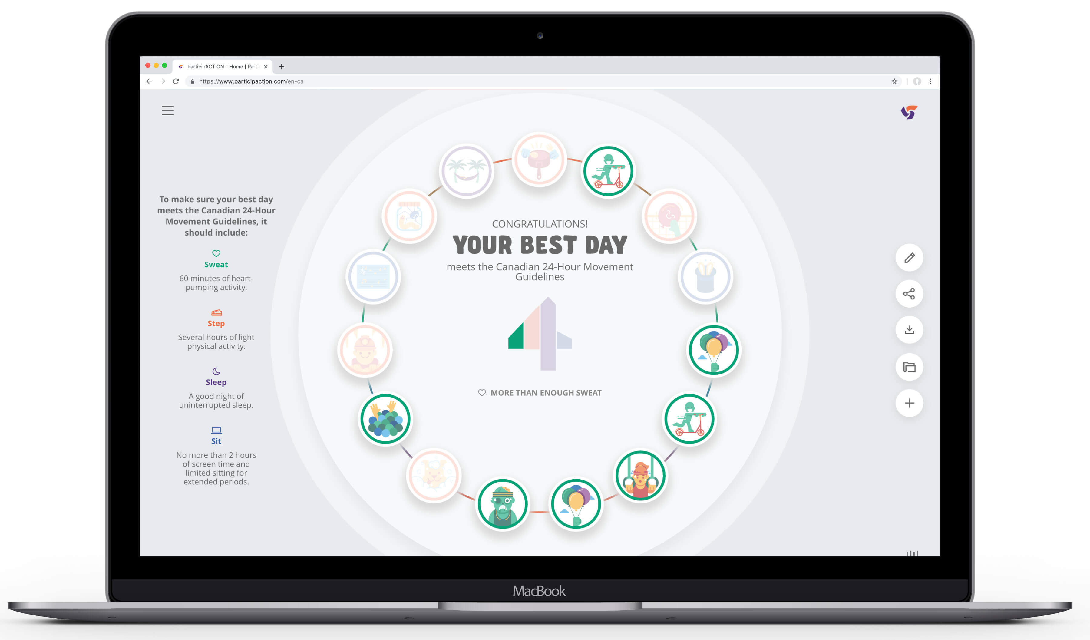
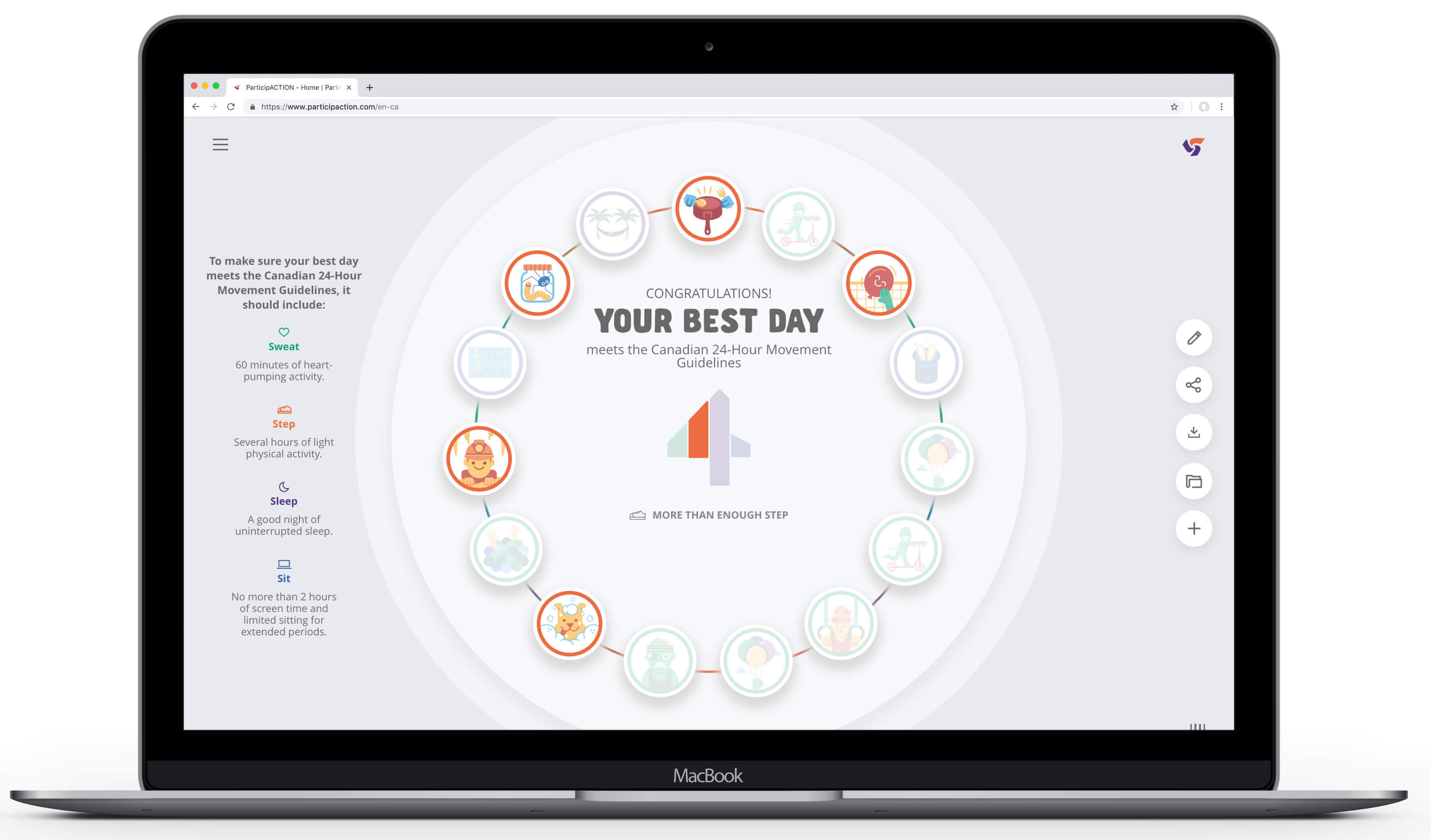
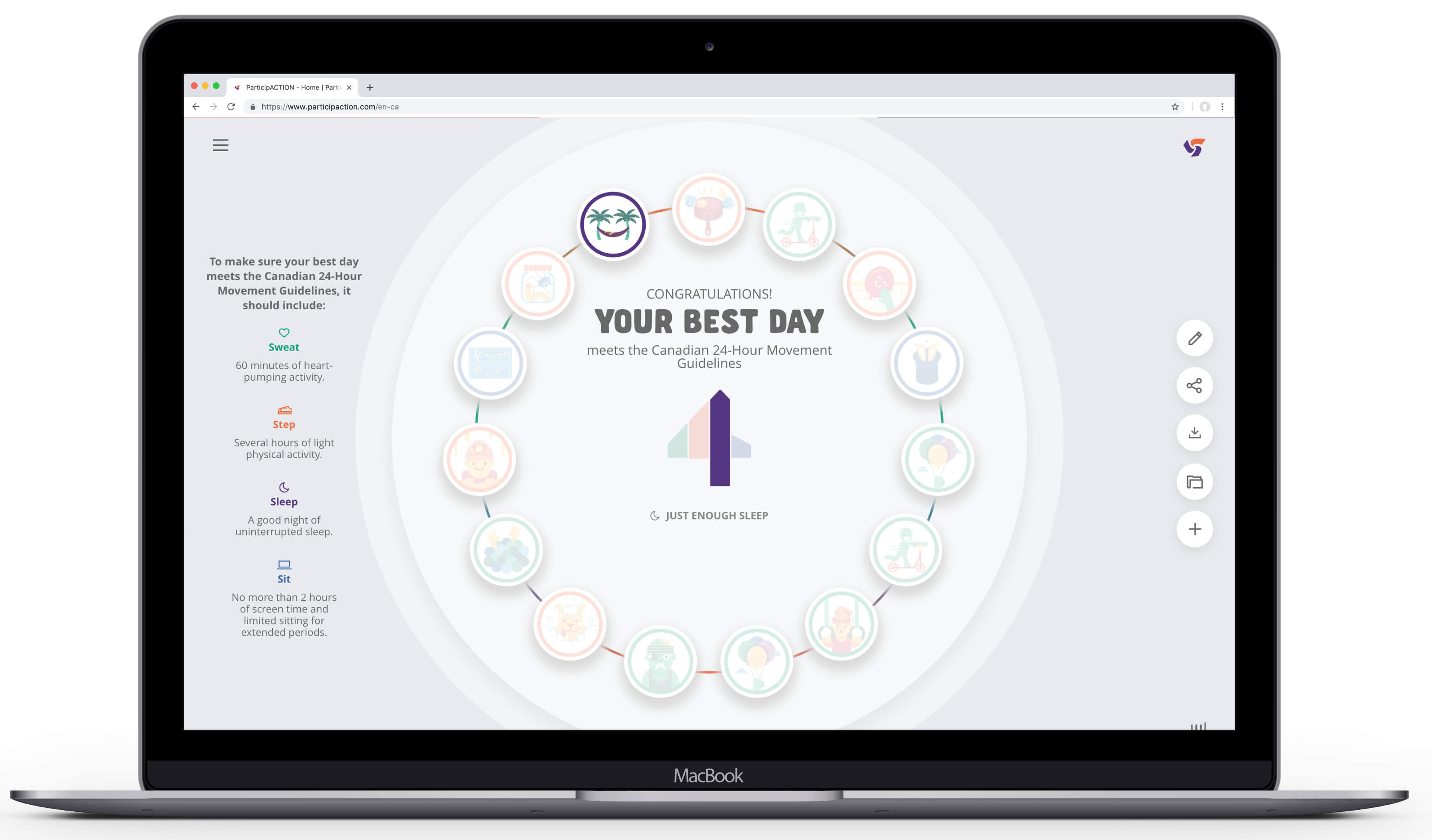
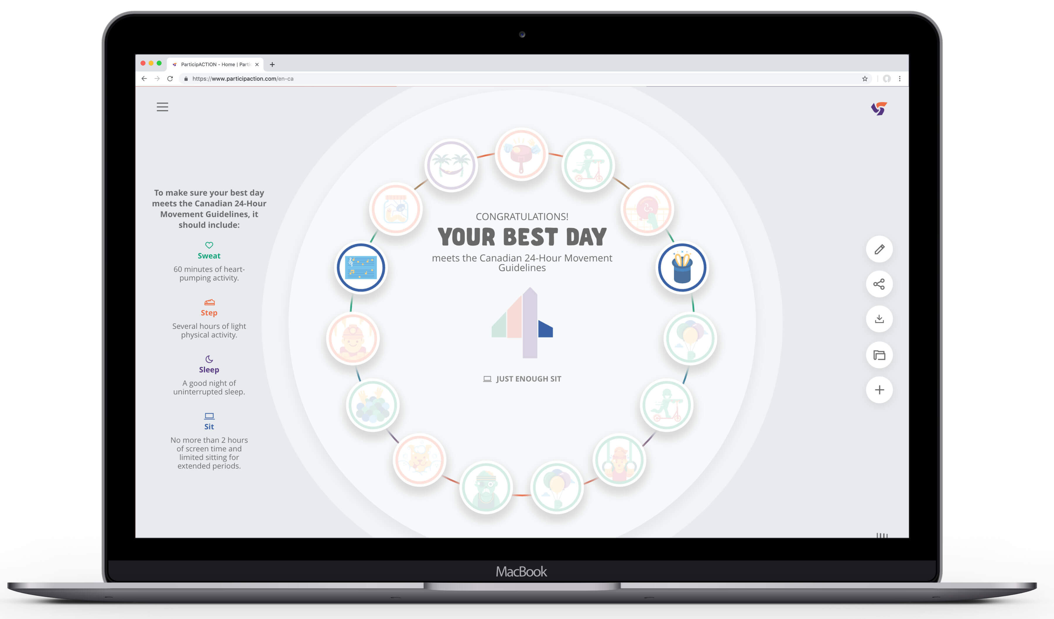
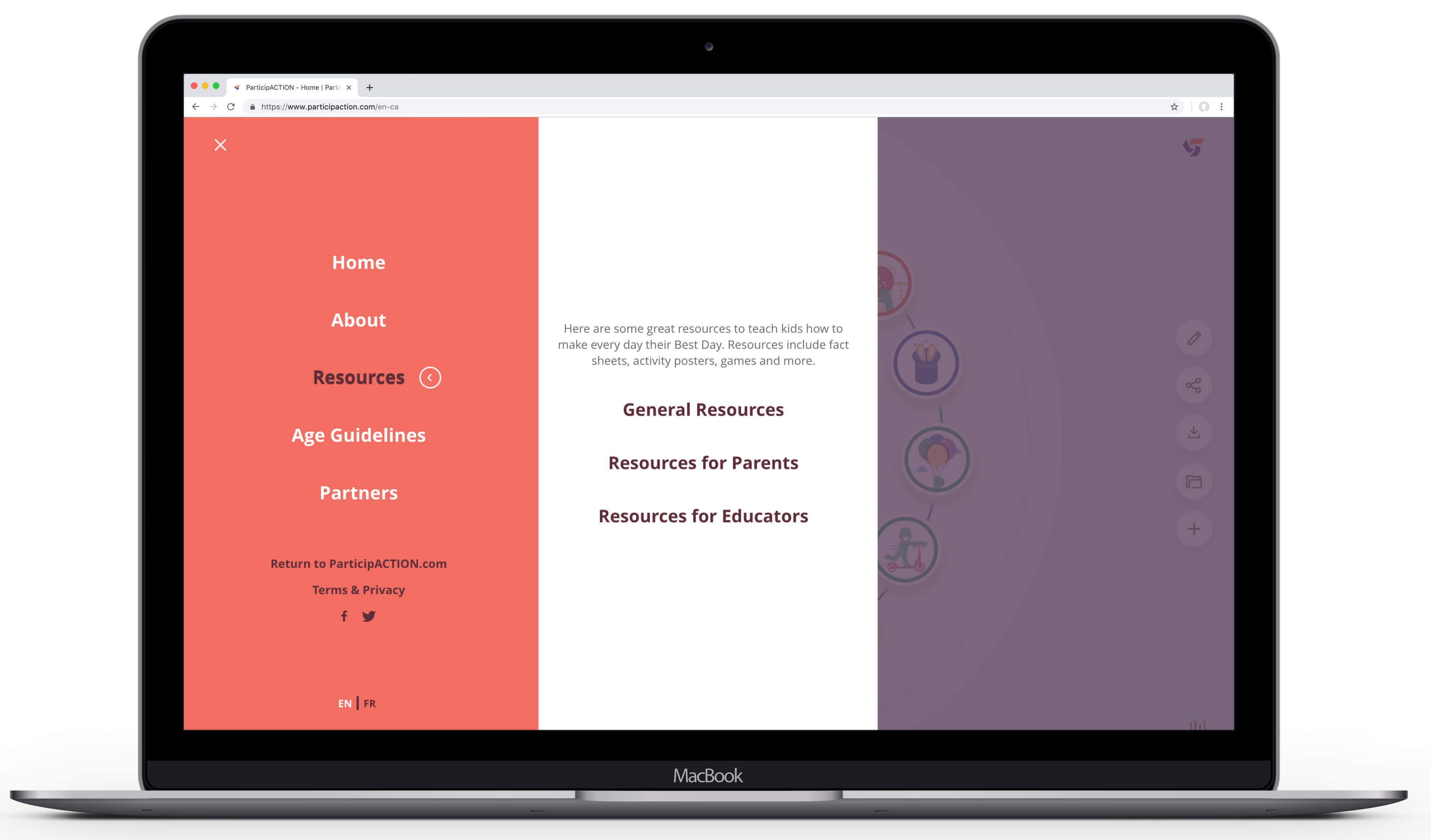
Our solution was to gamify the Guidelines through BuildYourBestDay.com, a colourfully illustrated experience that lets kids imagine and ‘build their best day’ from 180 activities in the categories of Sweat, Step, Sit and Sleep.
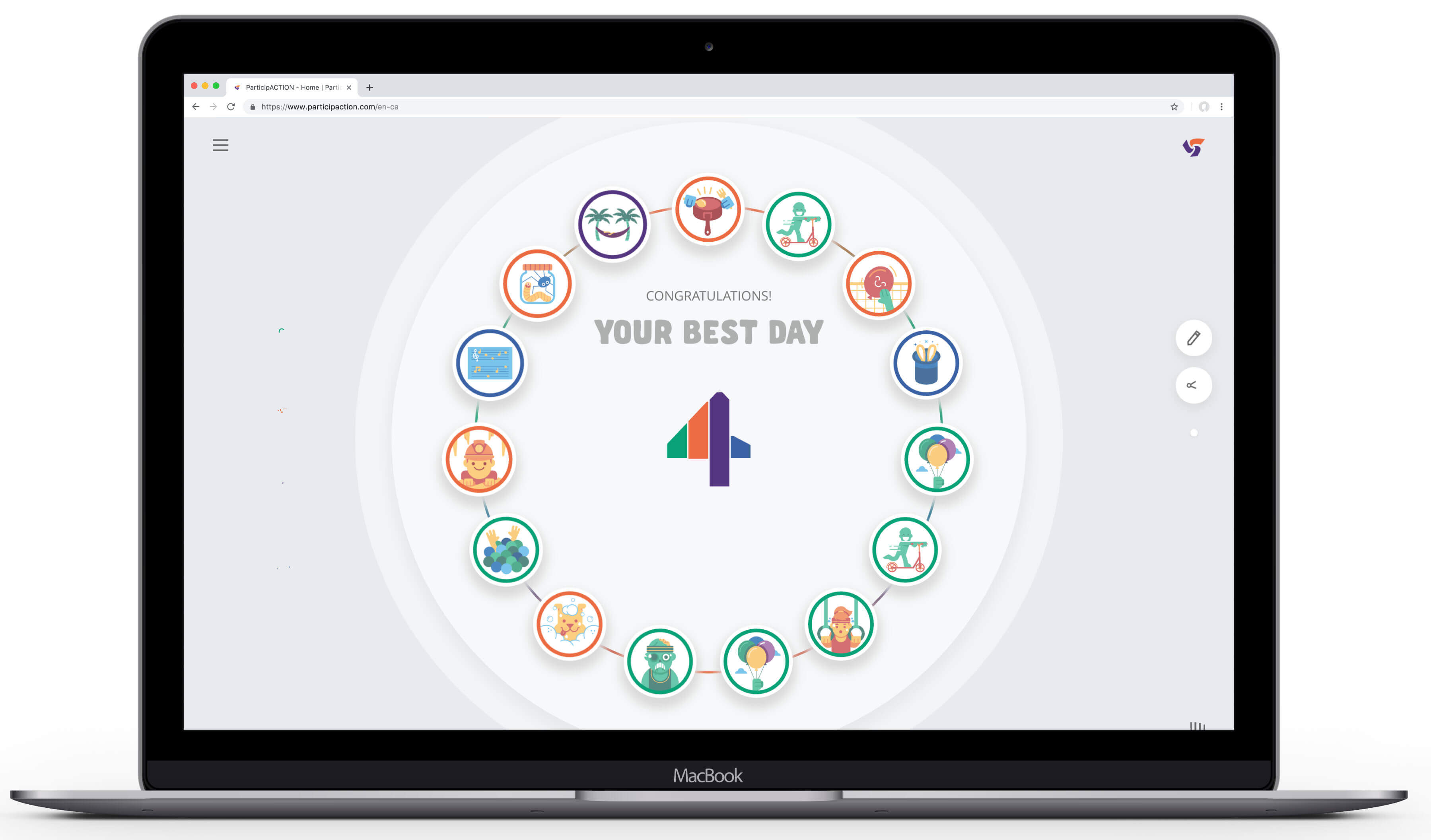
As kids move through the site their progress toward an imaginary day is tracked, with their selections triggering tips and practical teaching moments, such as not choosing screen-based activities right before bedtime. Upon completion, kids can see if their choices meet the Guidelines or not, adjust accordingly, and print a memento of their achievement.
The use of simple language and the “4 speeds of childhood” framework helped define the user experience and aid navigation. And the ability to print resources, such as activity sheets, colouring pages, play date invites and more were created to ensure the Guidelines stuck.
Given the wide demographic we needed to reach, the age and reading ability of our youngest users, and accessibility and language barriers to consider, keeping our ‘technology’ simple was a key success factor.
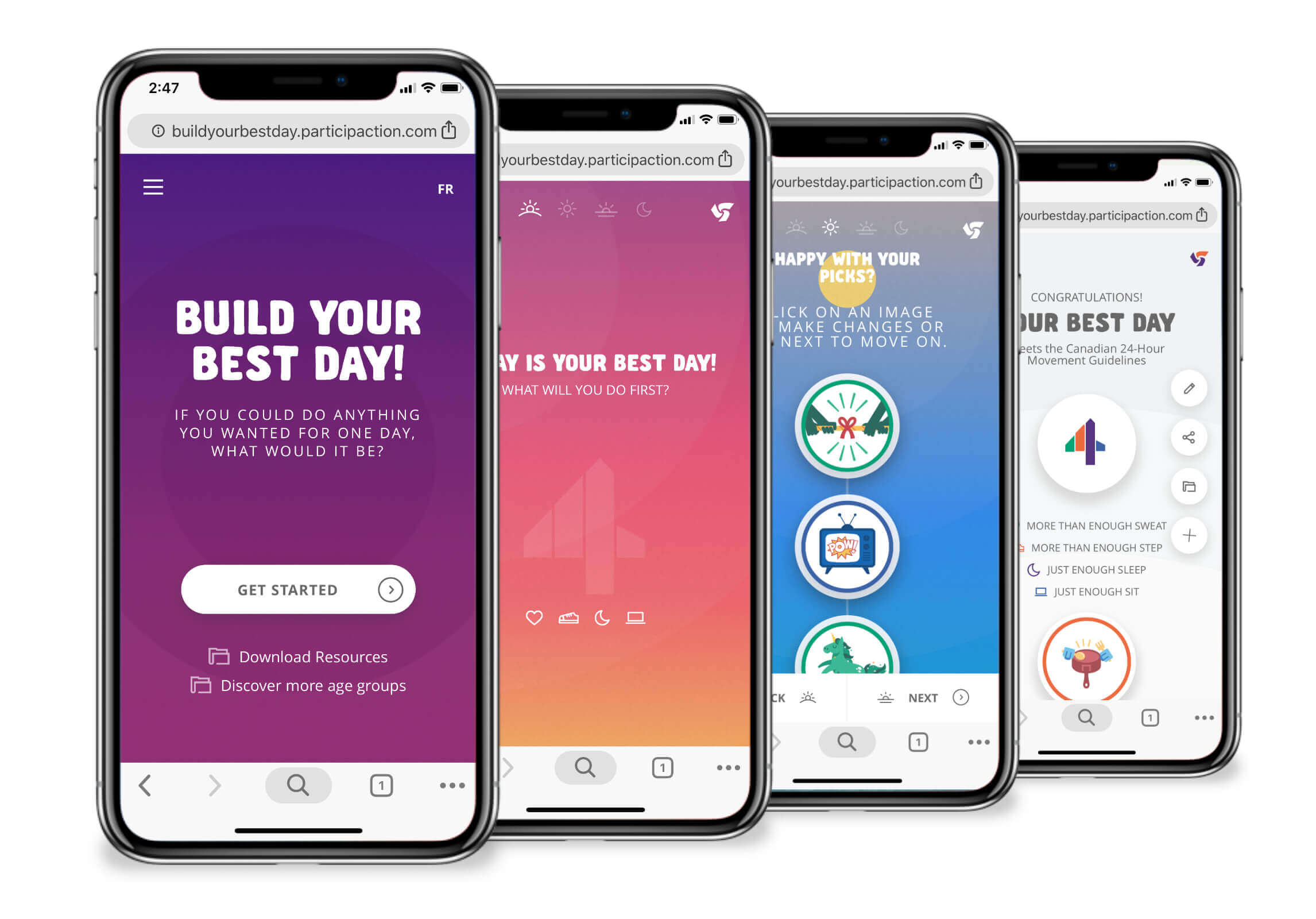
To keep kids’ attention, we created an experience that was both visually appealing and organized into bite-sized chunks. Colour, motion, iconography and sound was chosen to compete with today’s popular games and apps. And by segmenting the experience into day parts, we encouraged incremental progress toward the goal with minimal barriers.
To this end, users were allowed to complete the game no matter how many ‘mistakes’ they made. Those who didn’t meet the Guidelines were encouraged to go back and update their selections with clear callouts as to where they went wrong.

More Work
© Copyright 2023, Jonathan Webber. All rights reserved.


