CAMH.ca
Redesign
CAMH.ca
Redesign
CAMH.ca
Redesign
CAMH.ca
Redesign
CAMH.ca
Redesign
Rebuilding the digital foundation to support a Mental Health movement.
CLIENT: Centre for Addiction & Mental Health (CAMH)
AGENCY: Zulu Alpha Kilo
YEAR: 2018
ROLE: Content Audit, UX & Content Strategy, Copywriter, Creative Director
The challenge is (and remains) huge. Four out of five Canadians do not believe that mental health is as important as physical health. At the same time, 1 in 4 Canadians will be affected directly by mental health issues.
To effect change, the Centre for Addiction & Mental Health (CAMH) is on a mission to move us from a society that continues to think of and stigmatize mental illness as a non-medical issue, to one that views mental illness for what it really is – a treatable disease not unlike cancer – and is resolved to provide the funding and support the growing epidemic deserves.
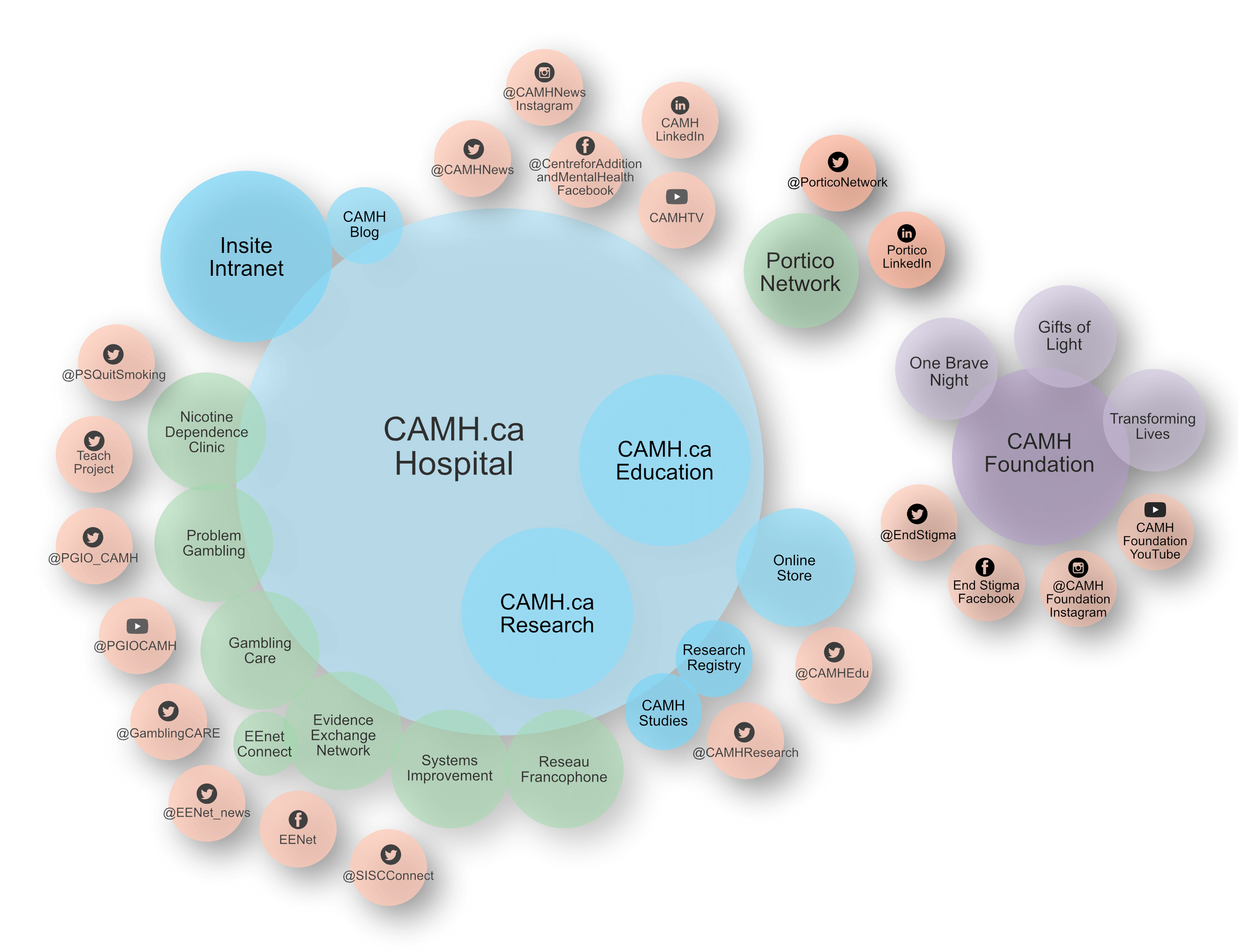
But as is the case with many large, multi-disciplinary organizations where communications isn't really the focus, their digital eco-system was all over the map – consisting of multiple domains, circular navigation, siloed content, a wild-west approach to social media channels and next to no governance over brand and message.
Certainly not structured to facilitate a consistent, single-minded message about who they are and all of the work they do on the treatment, science and research, public health and fundraising fronts.
From a design perspective, the issues were many. Glaringly, the site was not built on a modern CMS framework, nor was it optimized for mobile or tablet screens in any way. Beyond that and the obviously out of date aesthetics, multiple layers of tabbed navigation were designed to echo the organization's own siloed structure, rather than satisfy the task orientation and needs of those visiting the site.
OVERVIEW OF PRE-EXISITING CAMH DIGITAL ECOSYSTEM
Meanwhile, years without an organization-wide governance plan or any one-single point of contact to manage strategy had also left the site full of dead, redundant, or circular links, long forgotten or repetitive content pages.
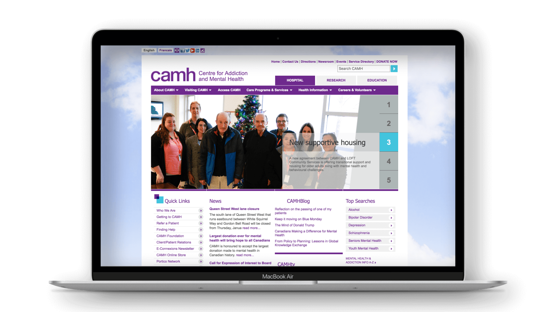
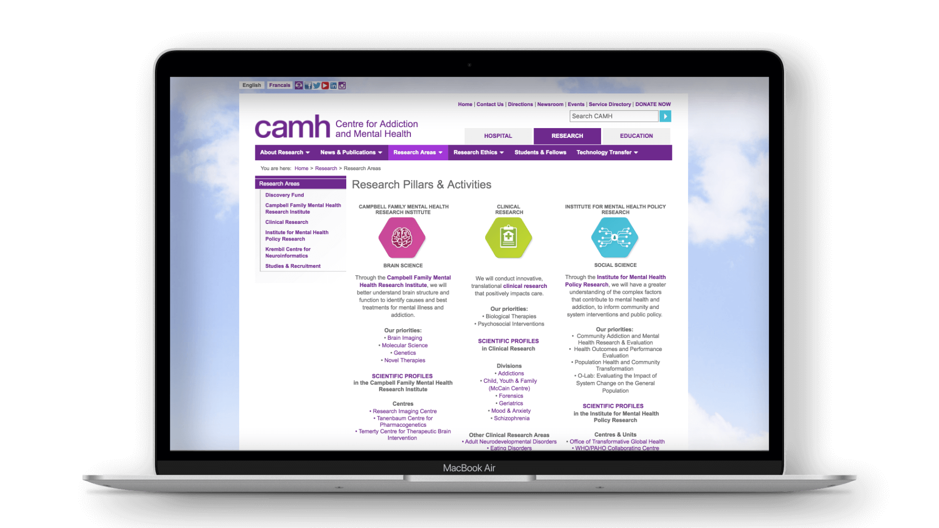
ORIGINAL CAMH.CA HOSPITAL & RESEARCH HOME PAGE DESIGNS
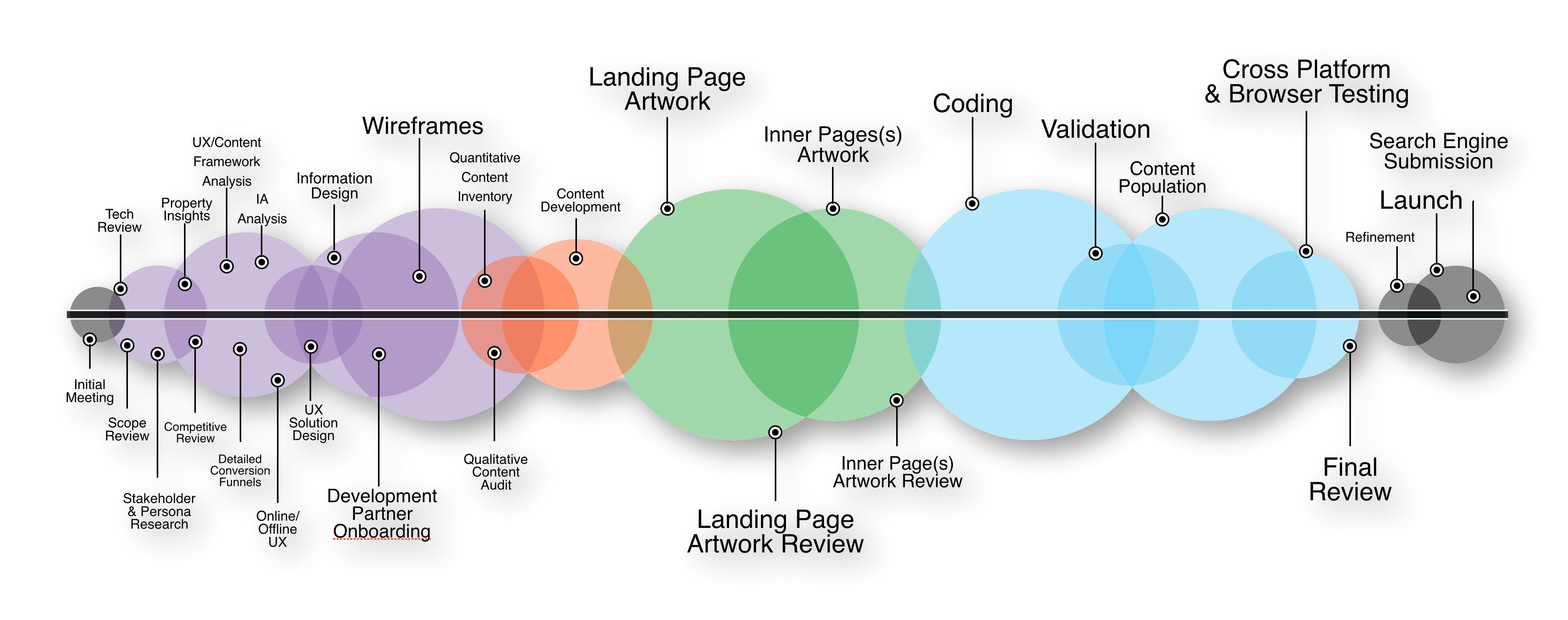
With an all new brand platform under development, we proposed a roadmap that would get CAMH.ca to a Phase 1 launch in time to coincide with the launch campaign. As part of this phase, we would lead a full discovery process including technical and content audits, UX strategy and design, wireframing and front-end UI design, development partner management, content strategy and launch plan.
The end result was a solution that not only provided a drastic improvement in visual appeal, content hygience, usability, wayfinding, and search optimization, but also lead to an overhaul of the organization's own internal approach to digital publishing, collaboration and governance.
OVERVIEW OF CAMH.CA PHASE 1 AMALGAMATION PROJECT PLAN.

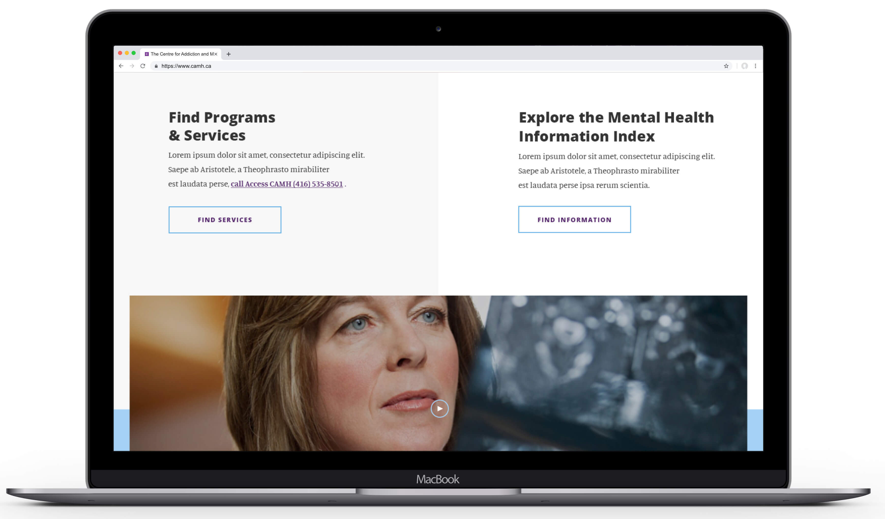
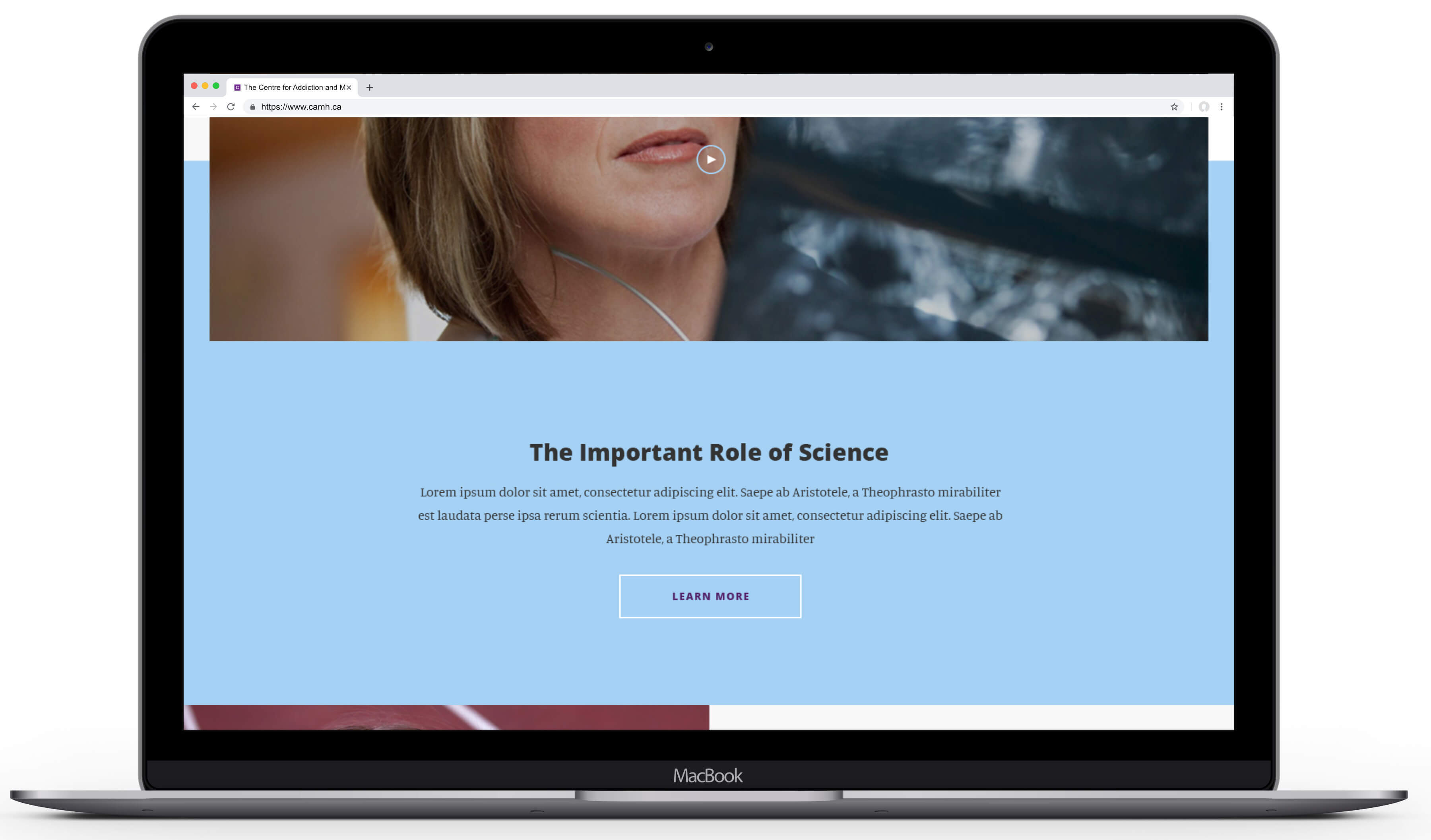

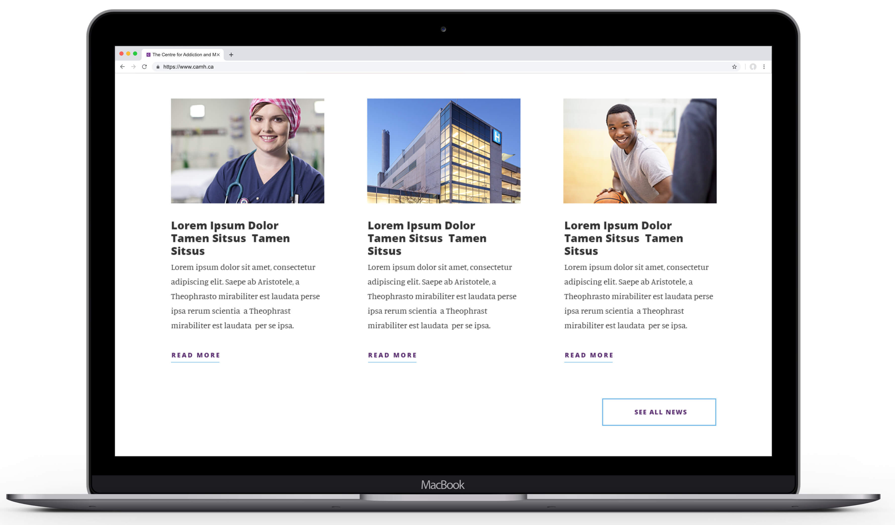
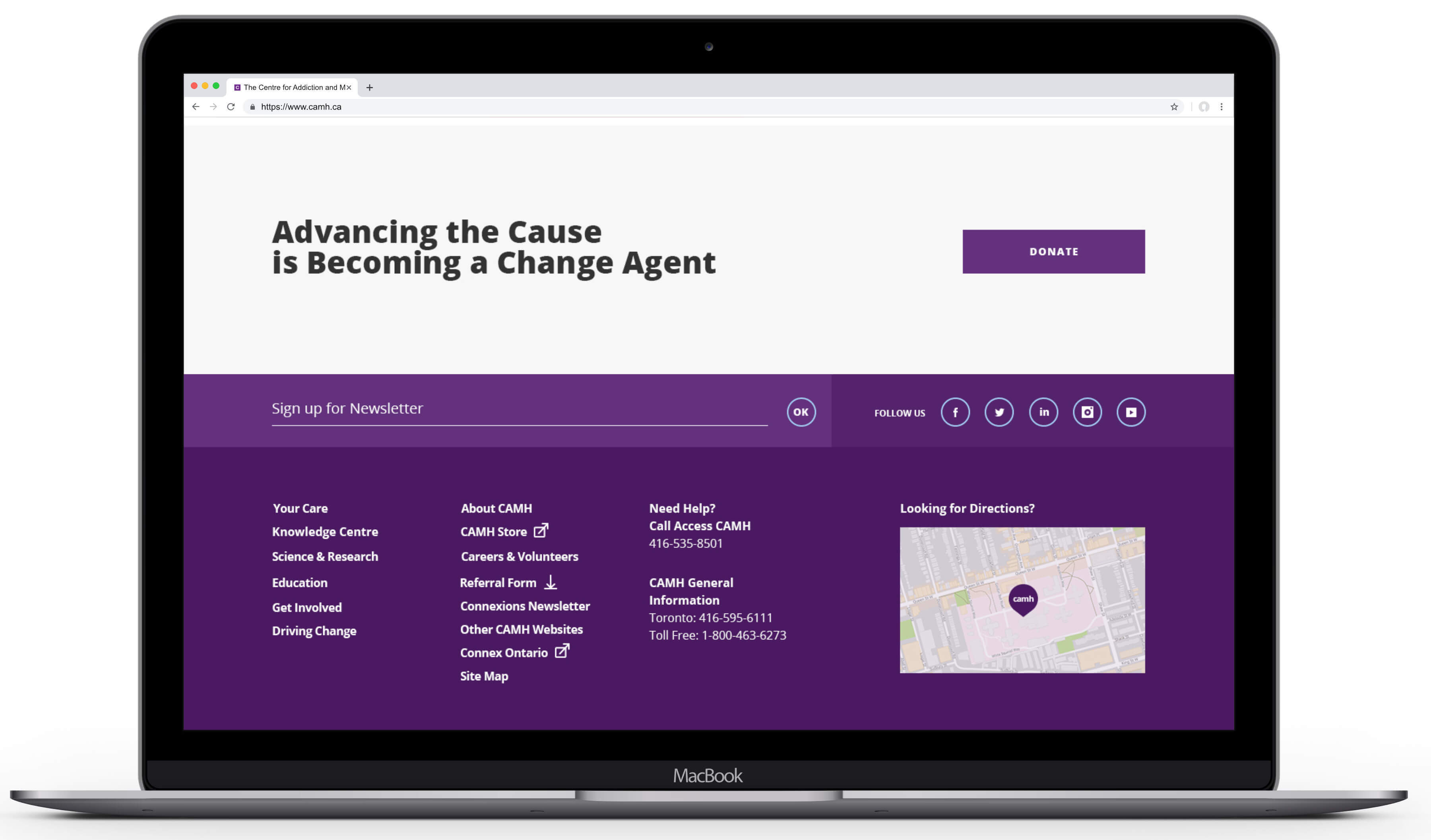
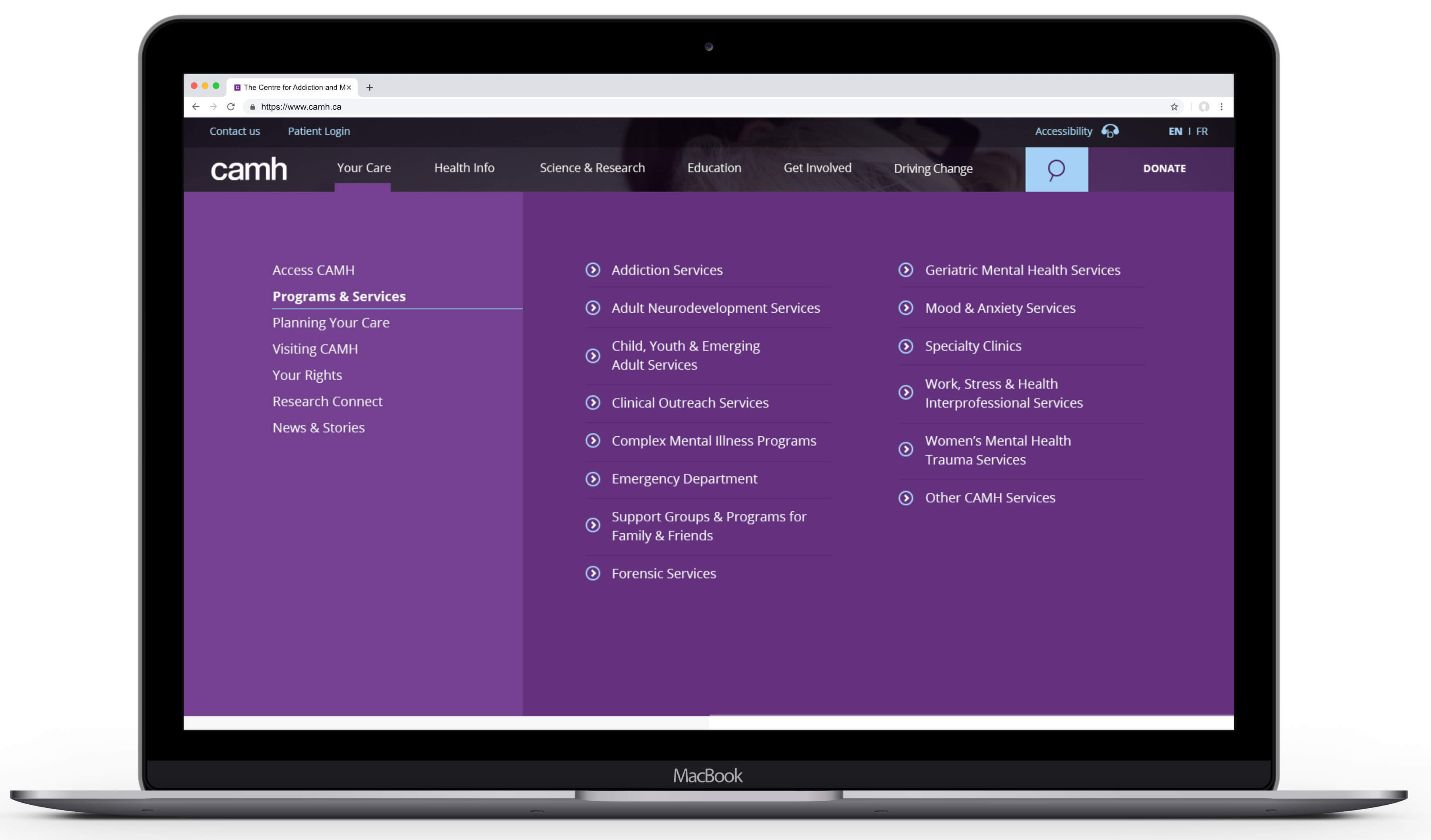
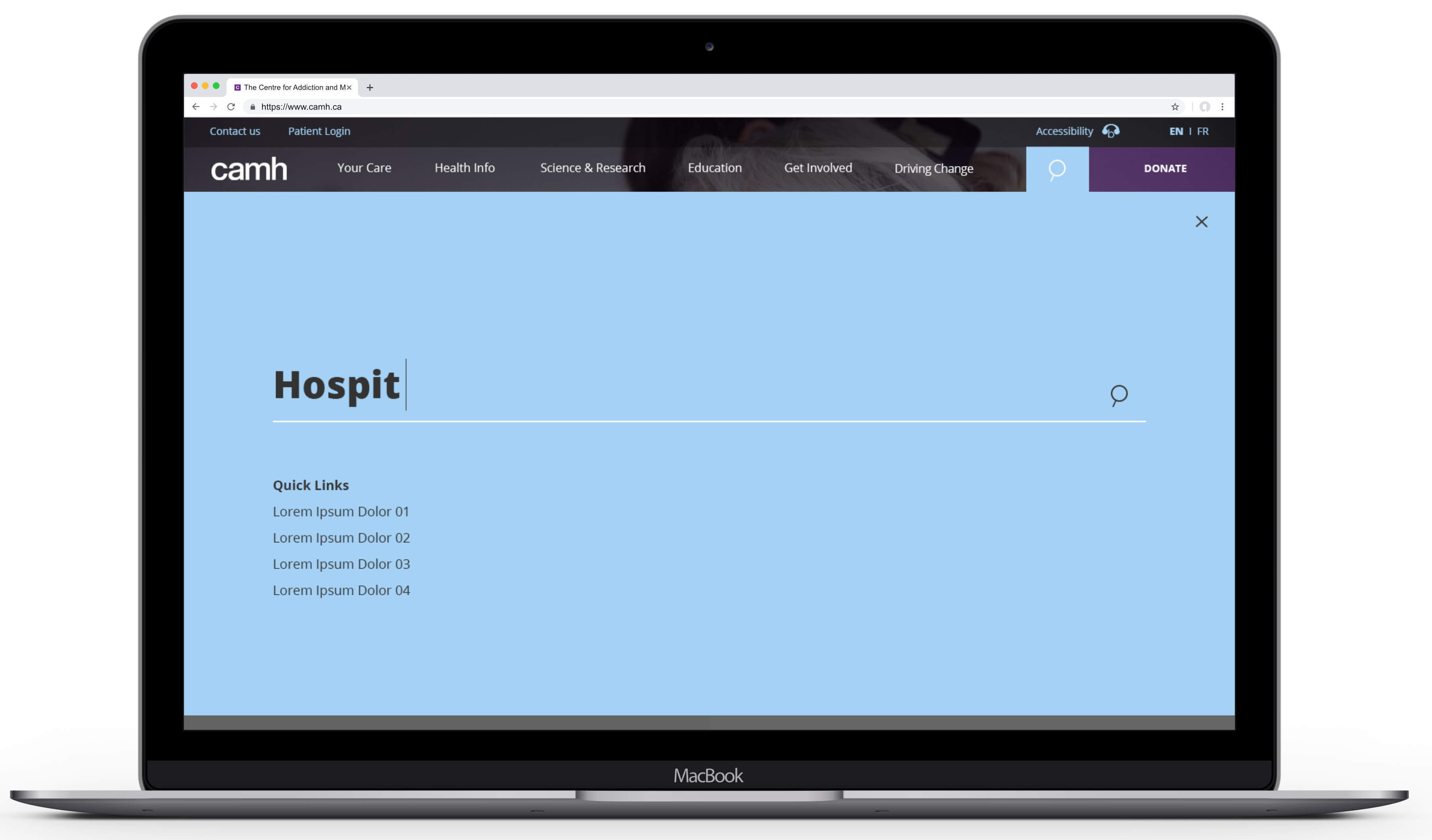
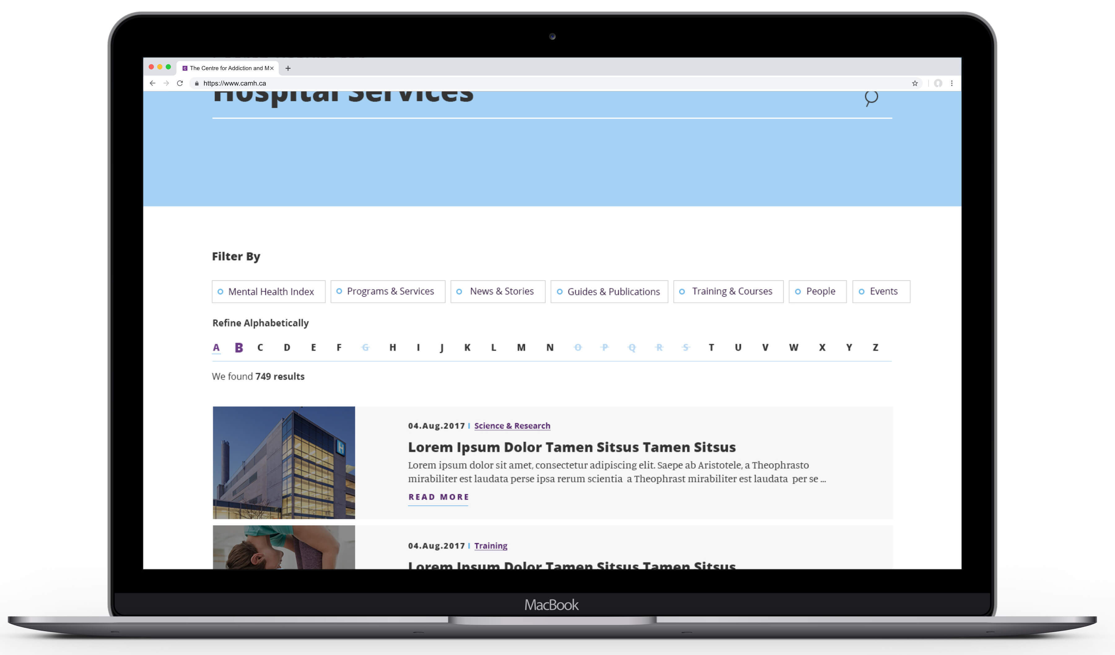
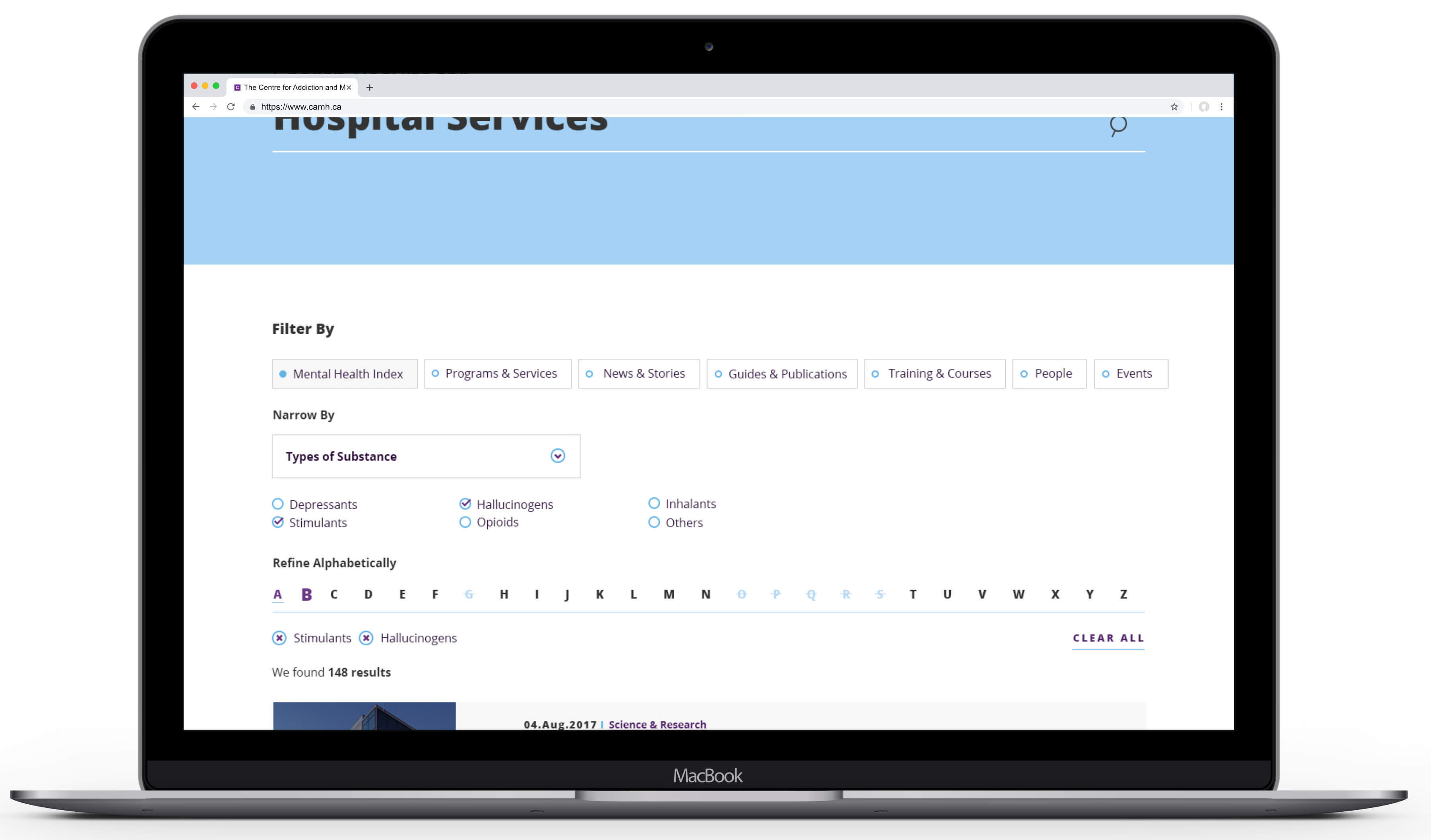
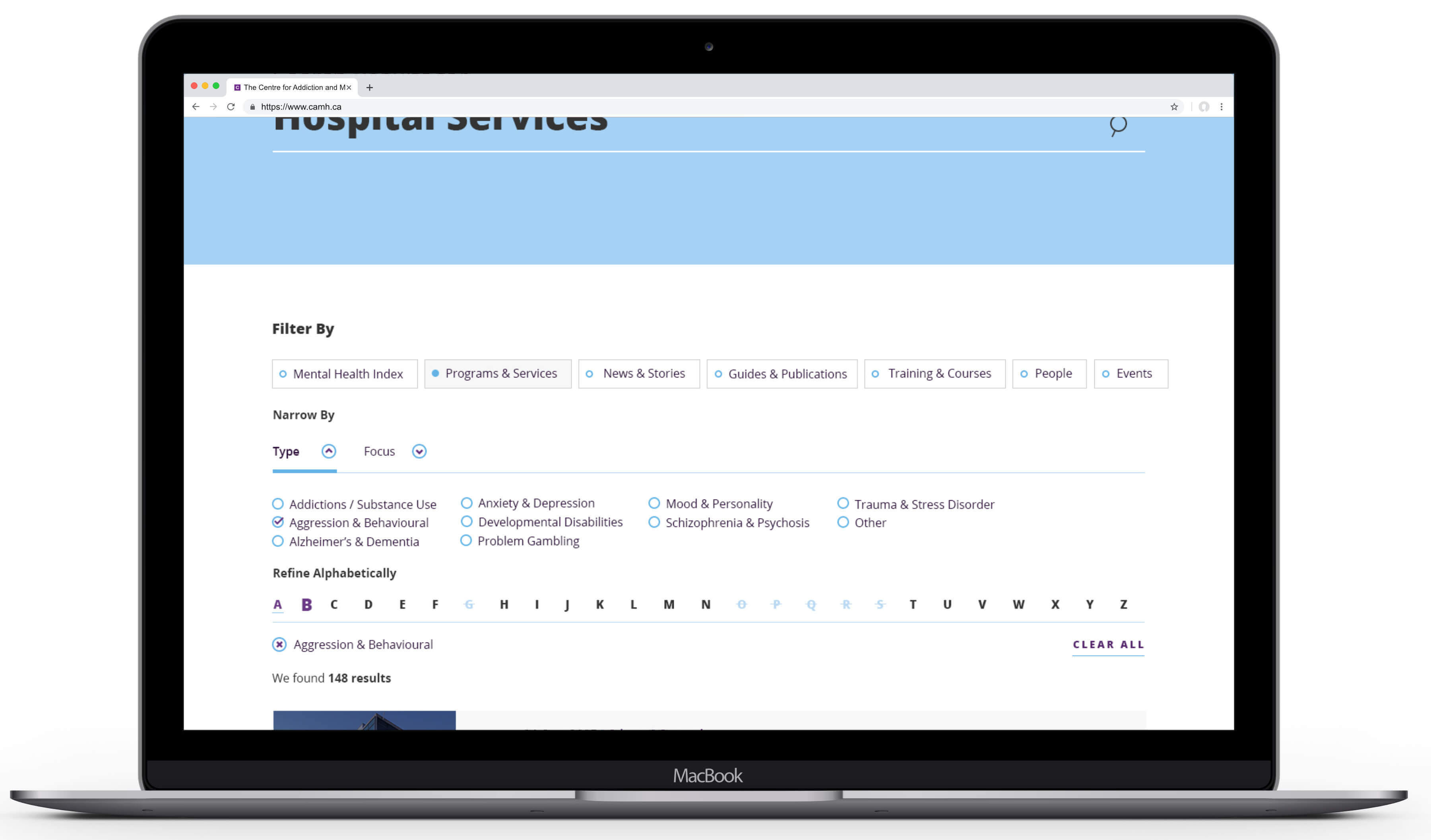
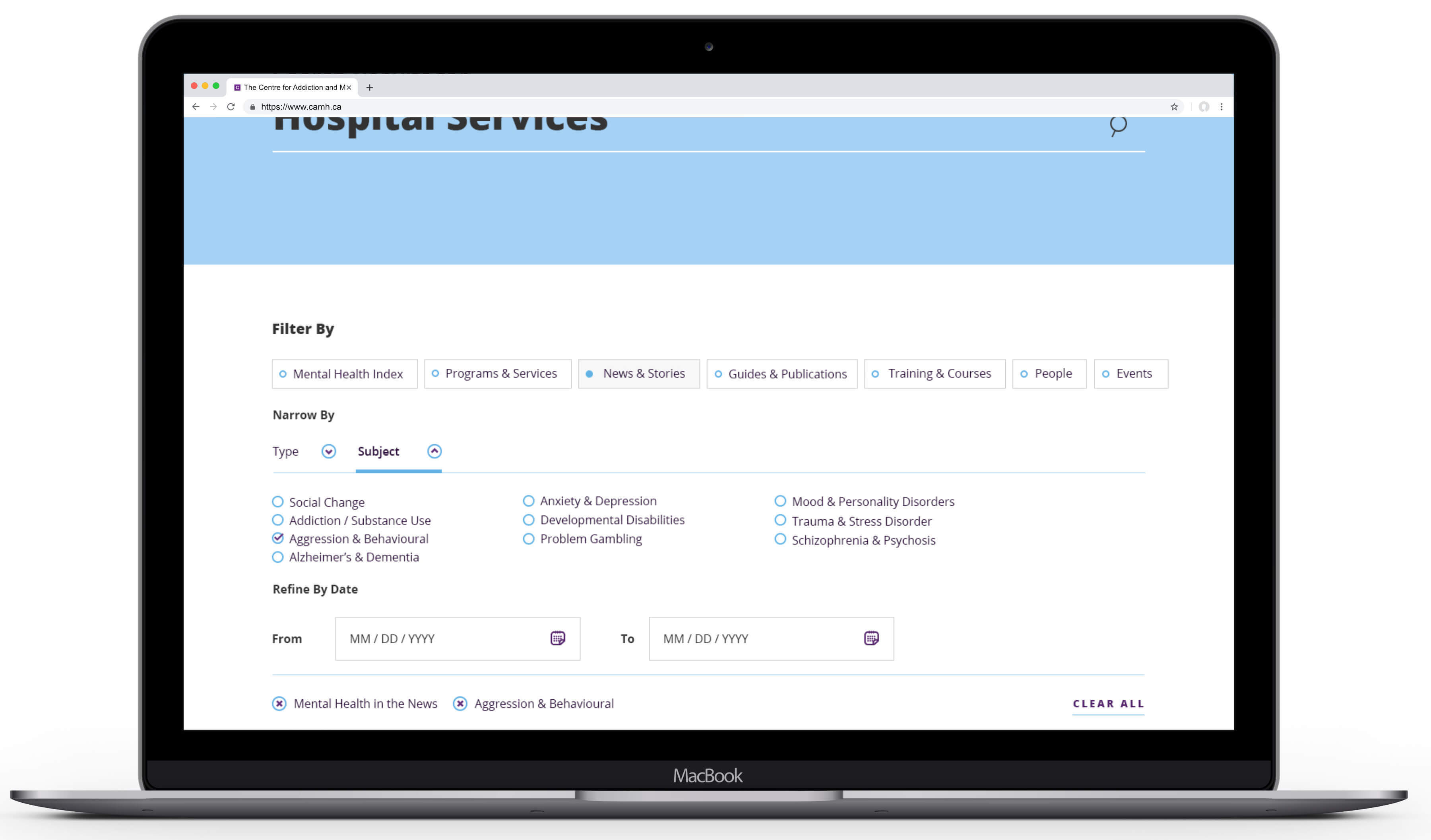
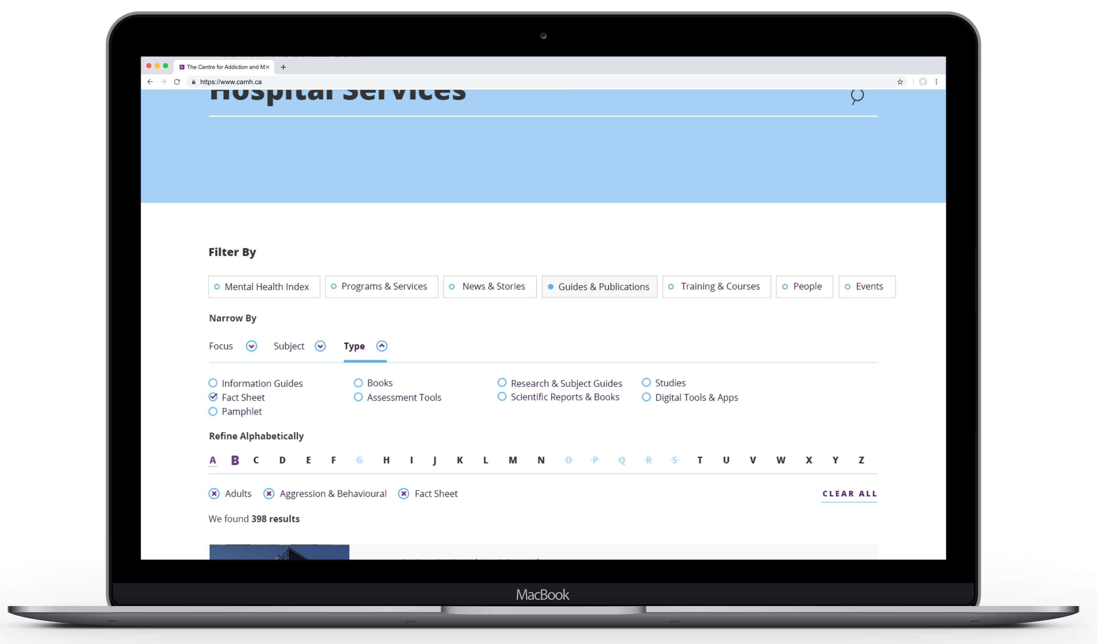
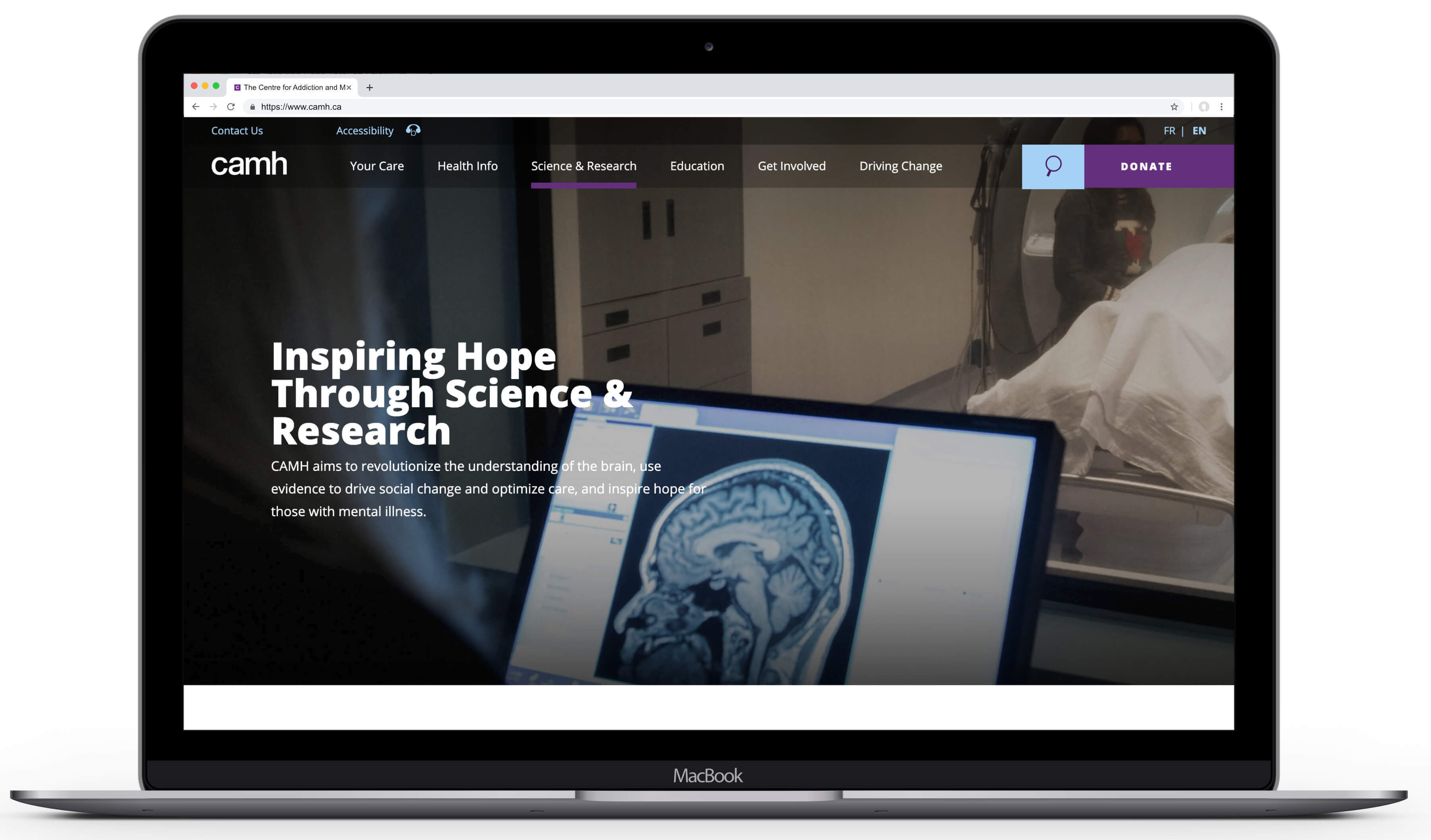
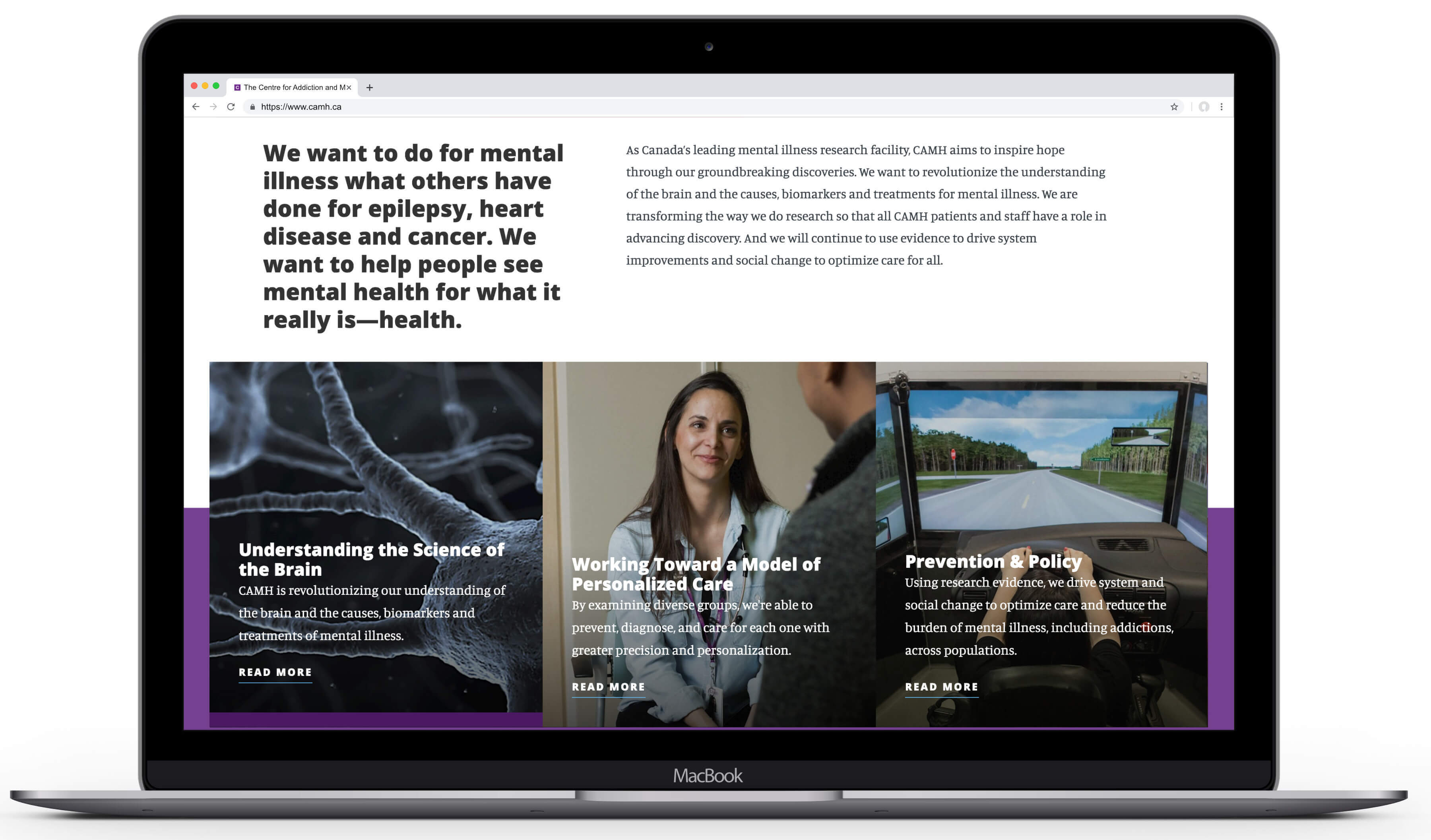


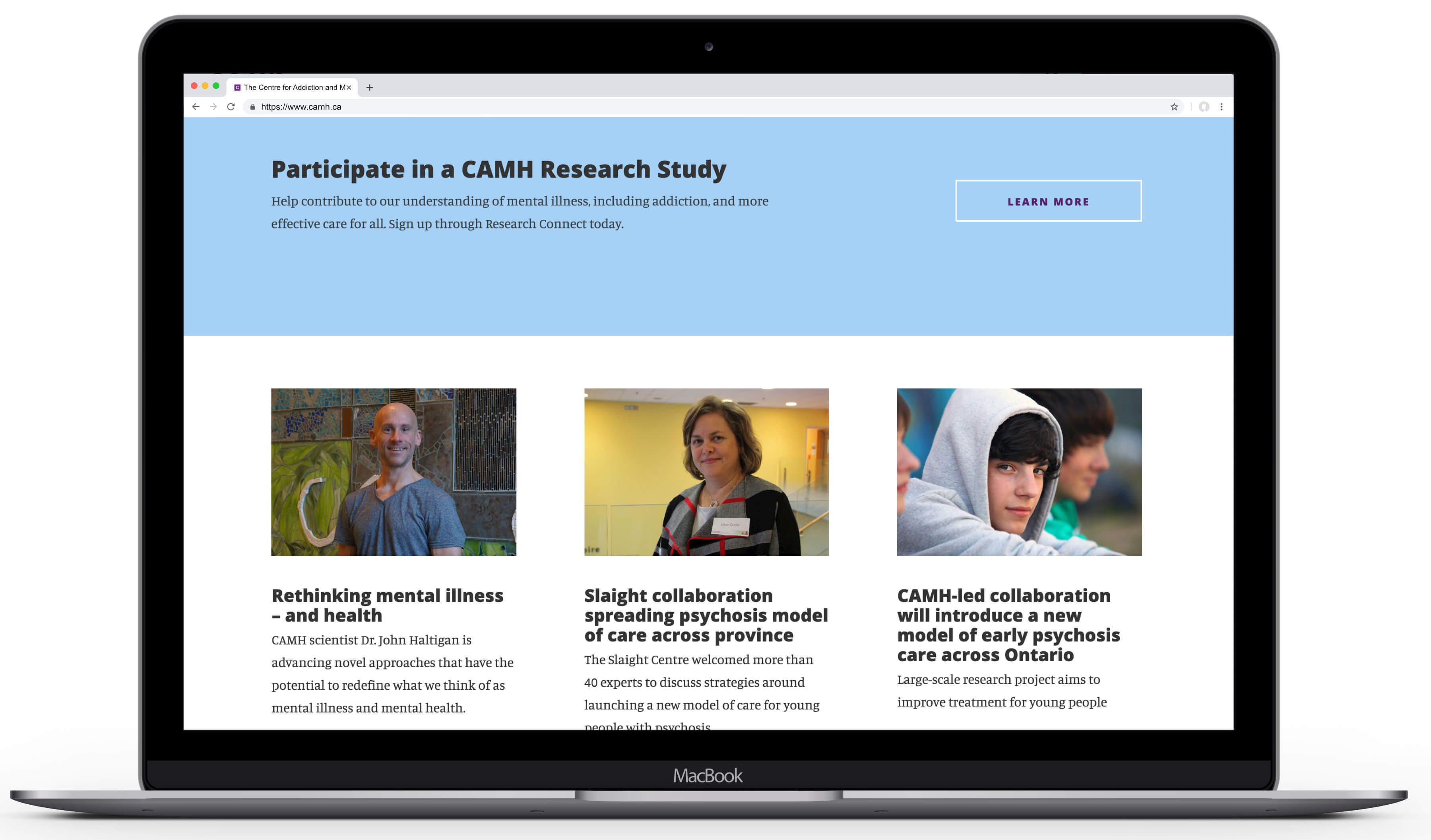

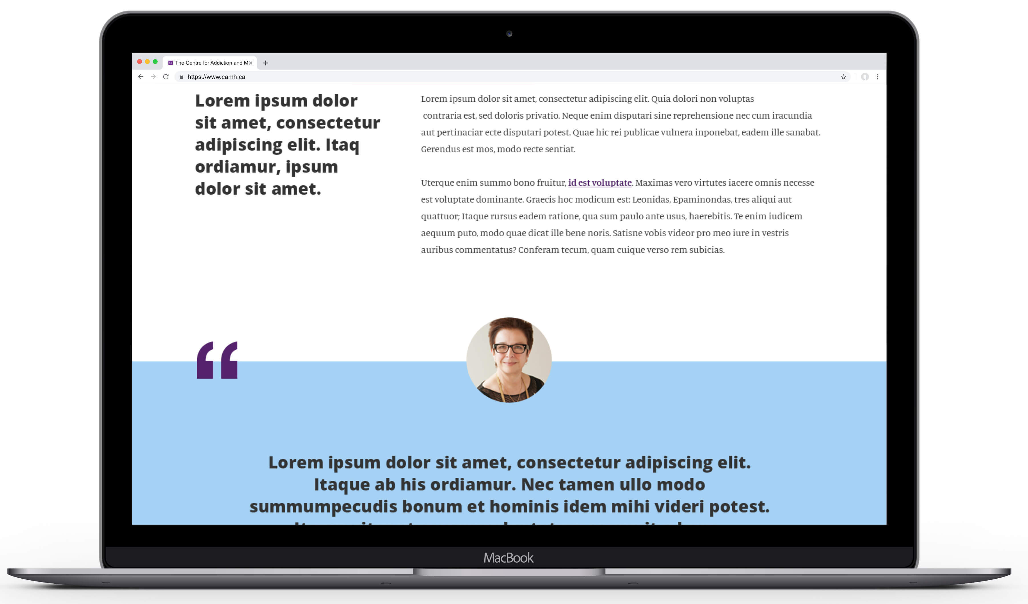
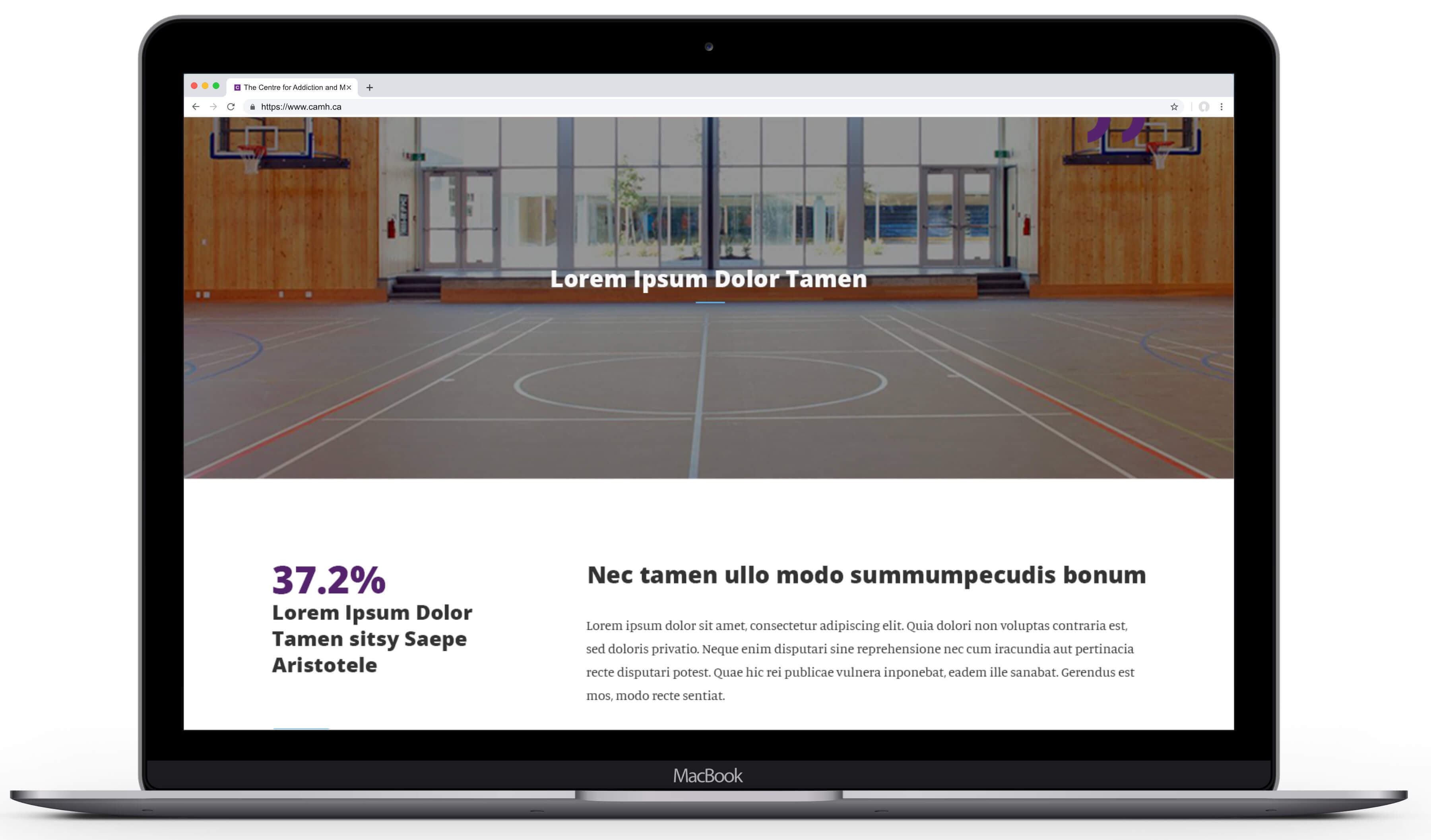
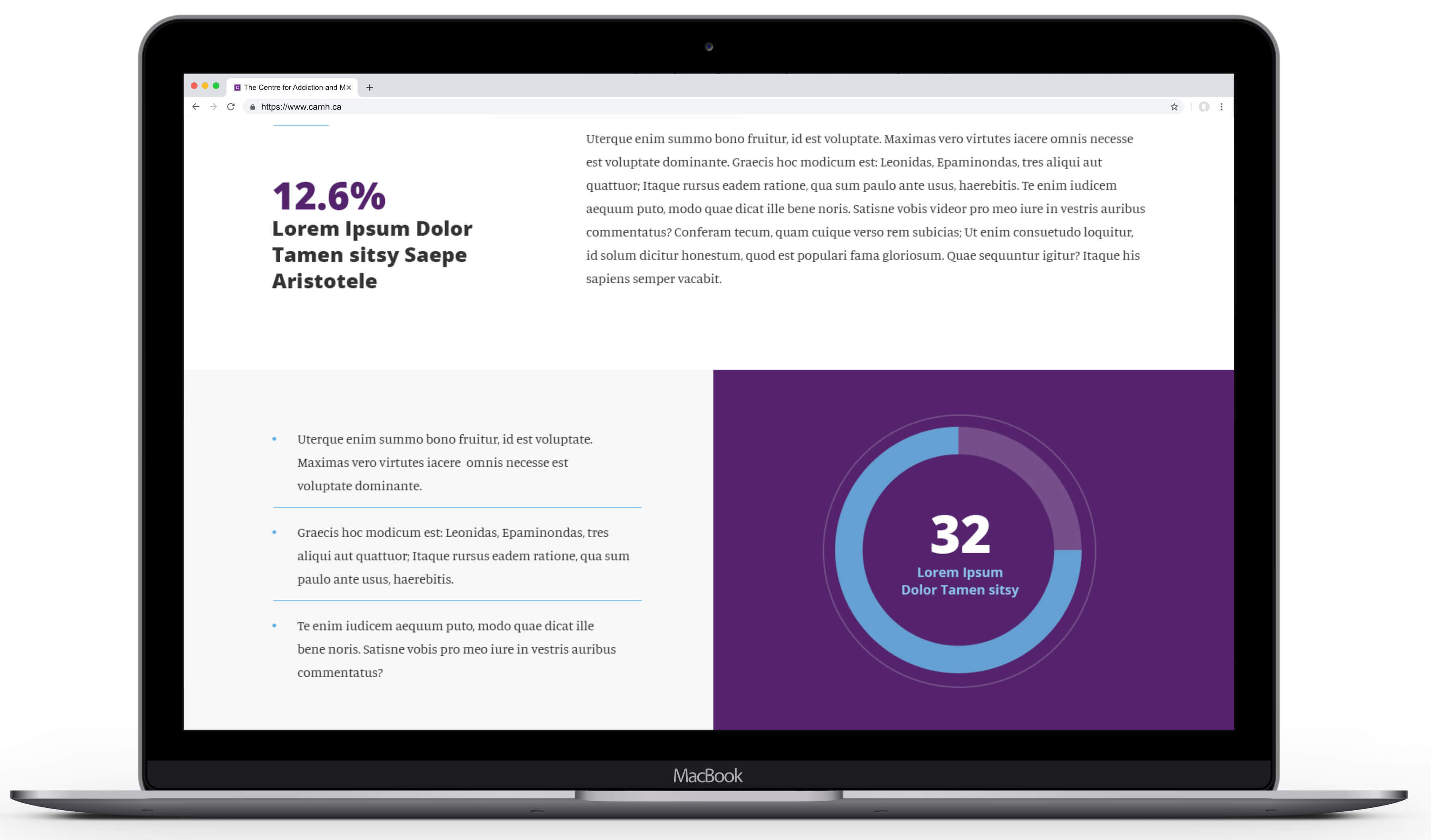
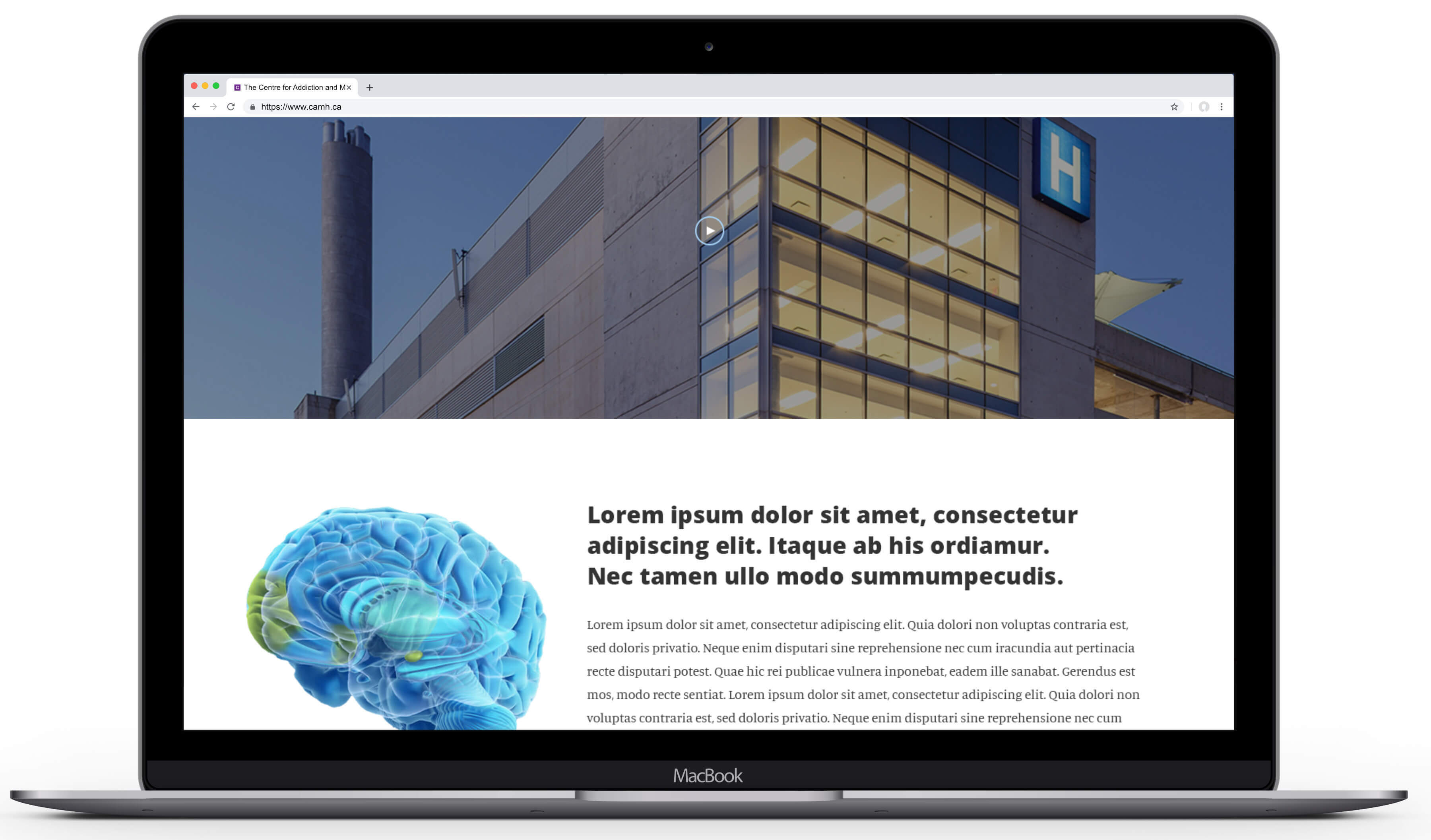
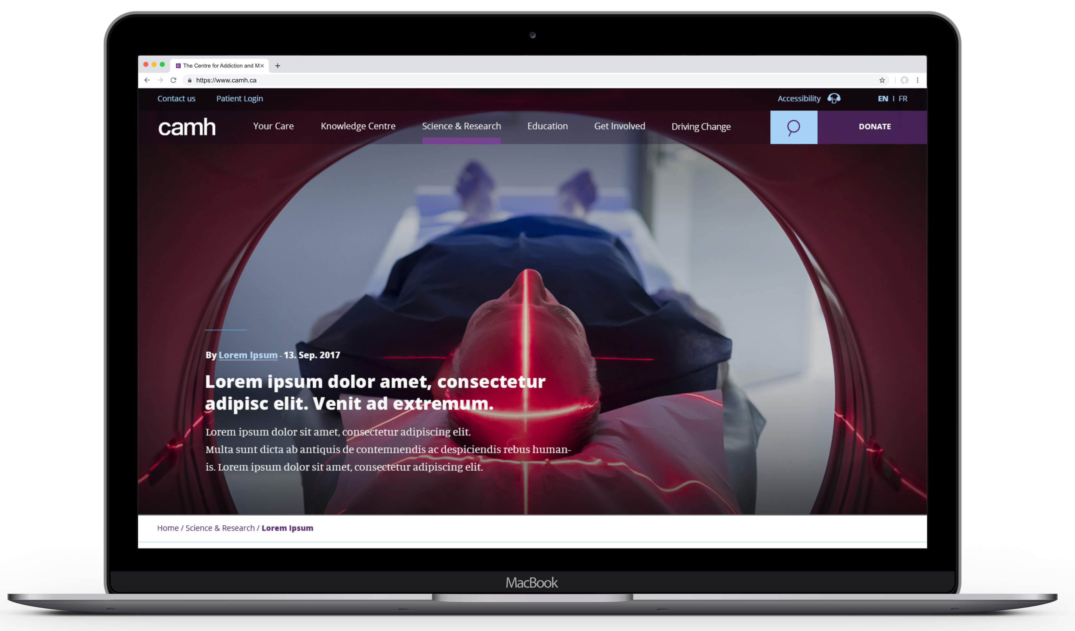
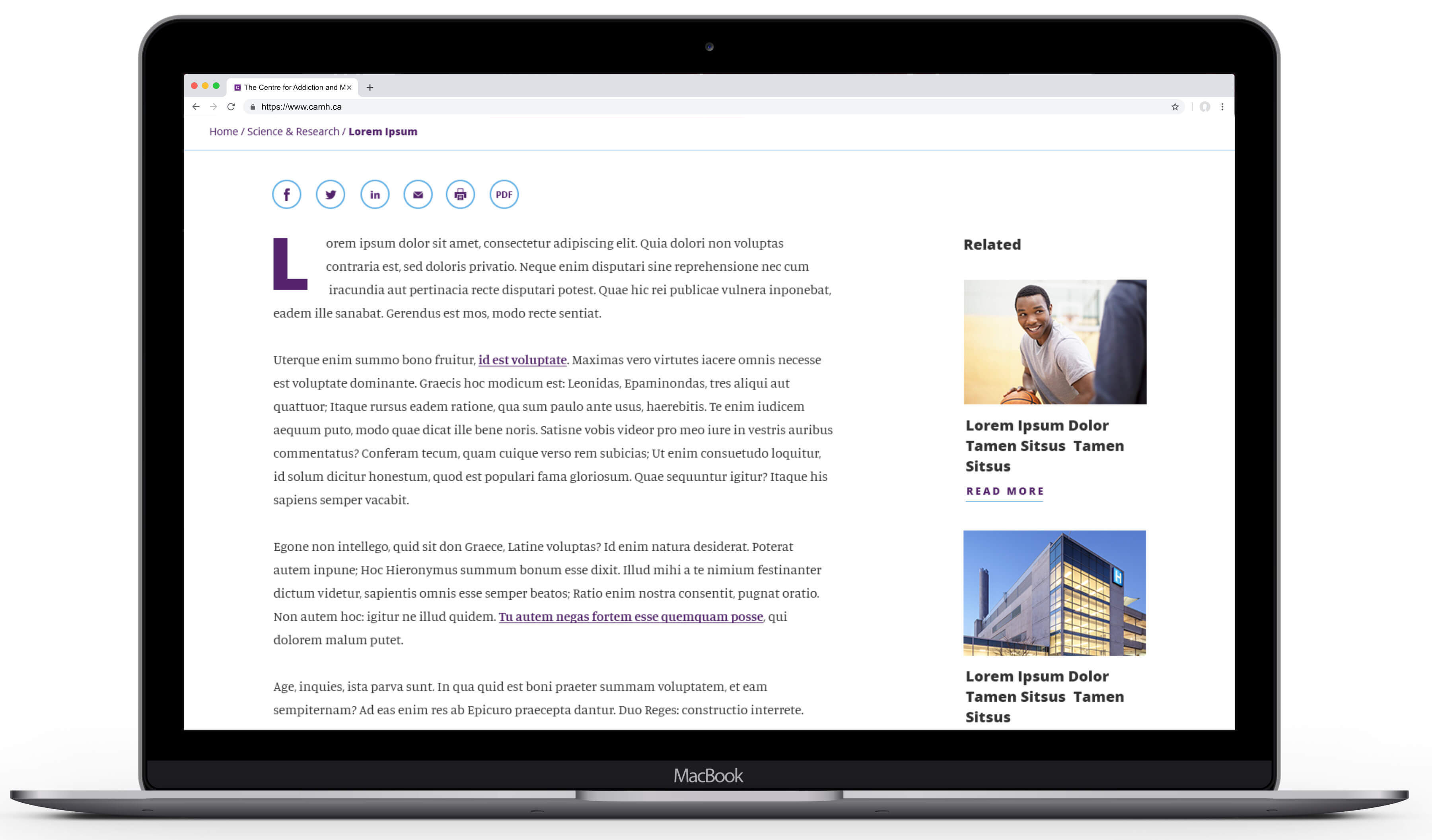
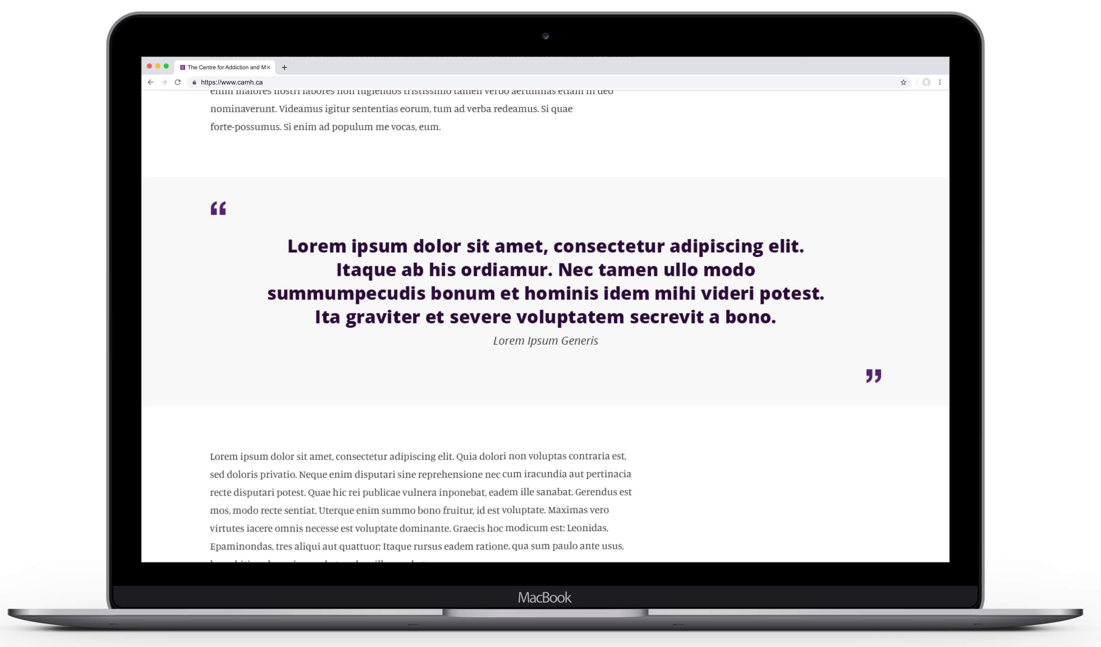
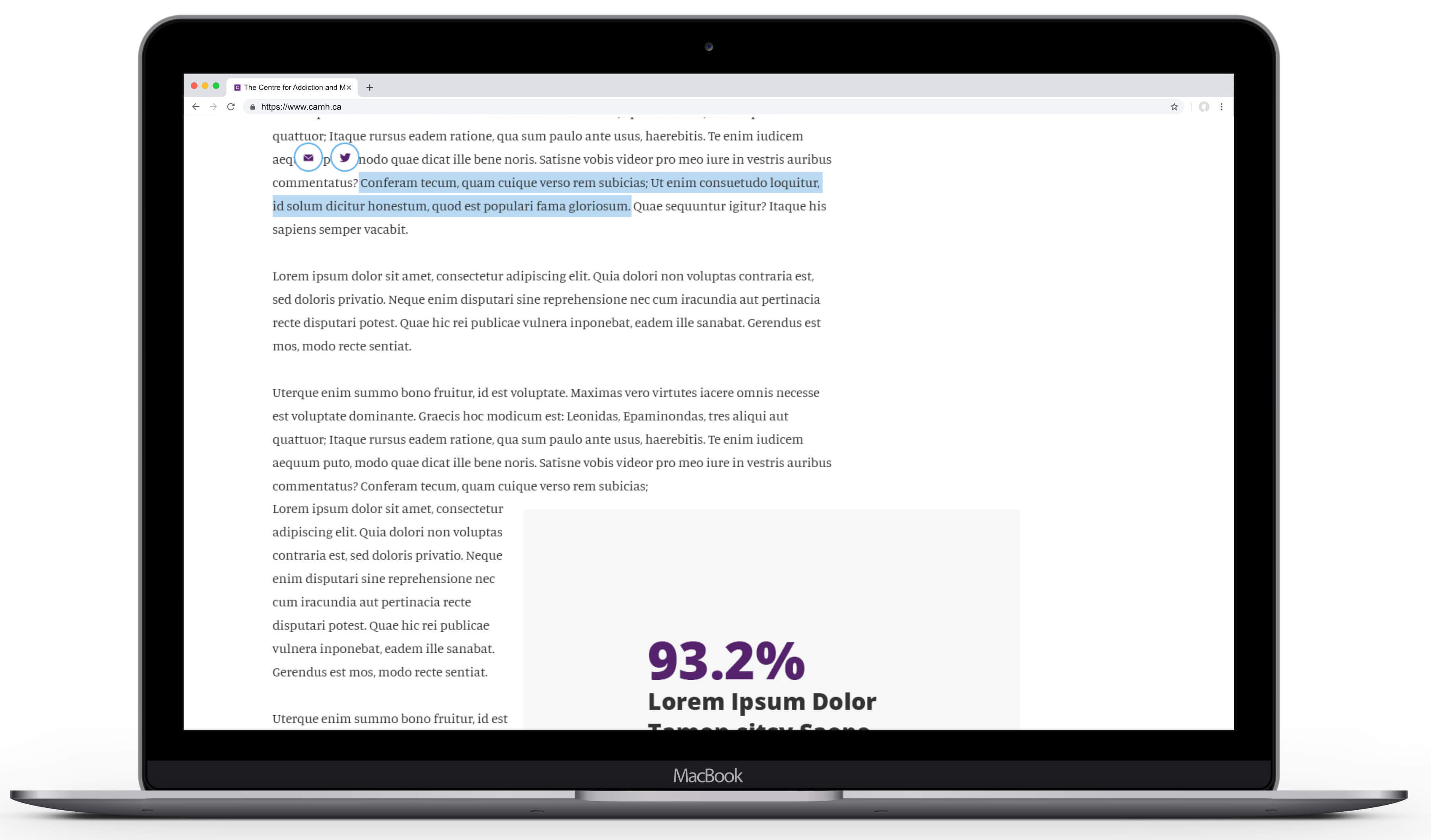
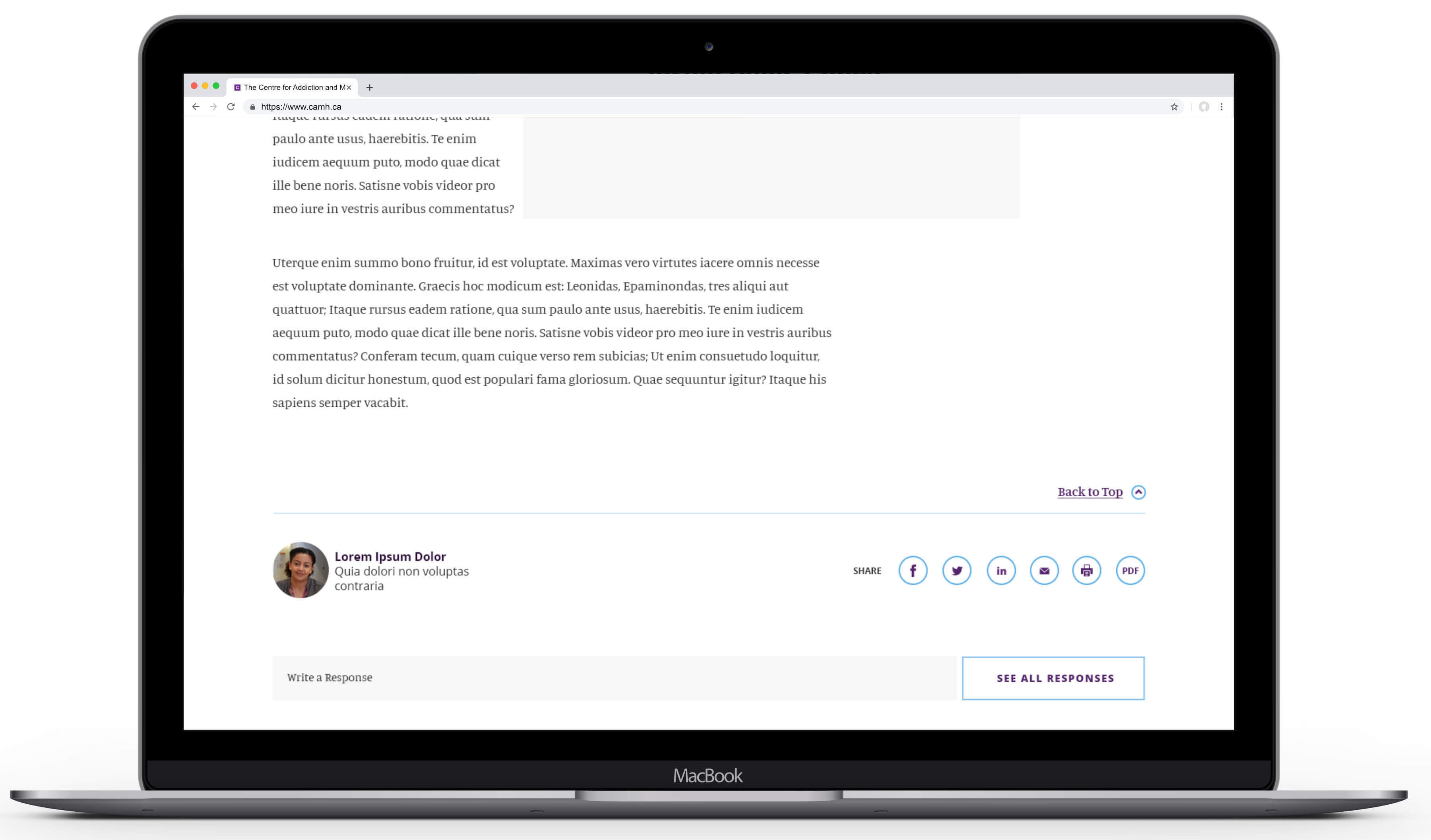
* PHOTOSHOP MOCKUPS HAVE BEEN USED ABOVE FOR DEMONSTRATION PURPOSES
Highlights of the updated solution include:
- Restructuring of the global content pillars along user-centric lines vs. internal departmental lines. This meant splitting health information and materials meant to support public health education apart from content related to CAMH's role as a teaching hospital – both technically under the purvue of the Education Department.
- Eliminating the CAMH Foundation's separate microsite and much of the forward facing language positioning the CAMH Foundation as a separate entity from the Hospital and Research Facilities.
- Augmenting the presence of Science & Research activities to better highlight the massive impact and world-leading discoveries being made by CAMH.
- A renewed focus on the development of shared taxonomy across departments allowing for better internal search, wayfinding and contextual linking.
- A complete overhaul of the platform, with a modular component-based design framework built on Sitecore, optimized for all breakpoints and fully compliant with AODA 'AA' standards.
The end result was a solution that not only provided a drastic improvement in visual appeal, content hygience, usability, wayfinding, and search optimization, but also lead to an overhaul of the organization's own internal approach to digital publishing, collaboration and governance.
Highlights of the updated solution include:
- Restructuring of the global content pillars along user-centric lines vs. internal departmental lines. This meant splitting health information and materials meant to support public health education apart from content related to CAMH's role as a teaching hospital – both technically under the purvue of the Education Department.
- Eliminating the CAMH Foundation's separate microsite and much of the forward facing language positioning the CAMH Foundation as a separate entity from the Hospital and Research Facilities.
- Augmenting the presence of Science & Research activities to better highlight the massive impact and world-leading discoveries being made by CAMH.
- A renewed focus on the development of shared taxonomy across departments allowing for better internal search, wayfinding and contextual linking.
- A complete overhaul of the platform, with a modular component-based design framework built on Sitecore, optimized for all breakpoints and fully compliant with AODA 'AA' standards.
More Work

© Copyright 2023, Jonathan Webber. All rights reserved.
