Everything
Gets Better...
Everything
Gets Better...
Everything
Gets Better...
Everything
Gets Better...
Everything
Gets Better...
...When you get active with ParticipACTION.
CLIENT: ParticipACTION
AGENCY: Zulu Alpha Kilo
YEAR: 2018
ROLE: UX & Content Strategy, Copywriter, Creative Director
Unfortunately, Canadians are simply not active enough, and as a 45-year-old brand synonymous with physical activity, ParticipACTION needed to refresh its dated image and its message in order to do something about it.
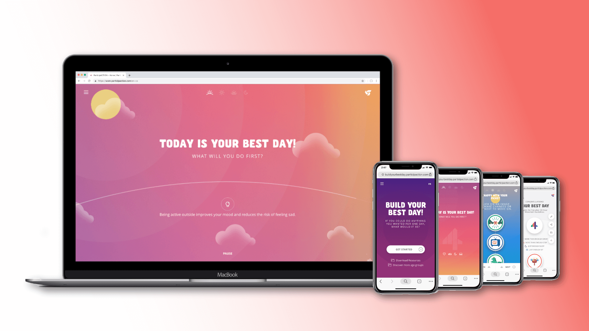
Launched through a national multimedia campaign and totally renovated brand website, the "Everything Gets Better When You Get Active" platform sought to place ParticipACTION at the heart of a new movement about movement. The rejuvenated brand showed Canadians that with daily activity as the foundation, all your goals in life can be achieved.
To break through category conventions – full of harsh, gritty colours, condensed, bold fonts, fitspo slogans, and skinny models – ParticipACTION’s new identity had to be approachable and inclusive, regardless of age, gender, location, ethnicity, ability and income. And importantly but perhaps somewhat counterintuitively, it had to focus more on outcomes and less on activity.
Retro nostalgia and kitsch have long been key to the brand's friendly appeal. In the updated design, Cooper Black type nods to our history with a contemporary flair, while the expanded colour palette complements the primary purple and orange without leaving them behind.
Imagery leaned heavily on iconography rather than super-fit people, allowing anyone to aspire to the outcome of their activity without having to aspire to unrealistic body images. Use of quirky found objects and atypical people also reinforced the charm and retro modern style we were after.
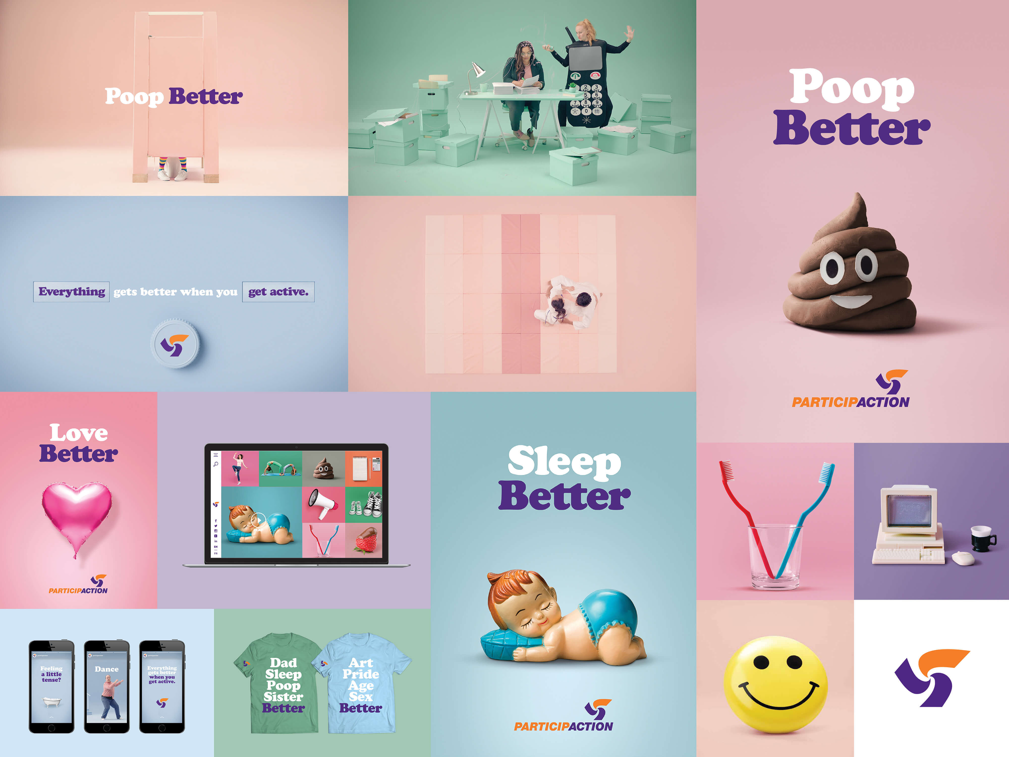
With quirky, thought provoking materials in market, the revamped website played a critical role in allowing Canadians to learn more and follow through.
To get there, we pushed ParticipACTION the organization to take a backseat to the obejectives of the core audience the website was really there to serve. After a full content-audit and stakeholder review, we augmented the user-centric design strategy around promoting exploration, breadth (the "Everything" part of the platform) and a sense of motion.
The side-scrolling grid design of the home page, combined with long scrolling interior pages and animated transitions, were all chosen to get people moving on their journey to being more active right from the initial load of the site. Content is pushed to the forefront where it can promote itself, with traditional global navigation easily accessible but hidden behind the hamburger menu.
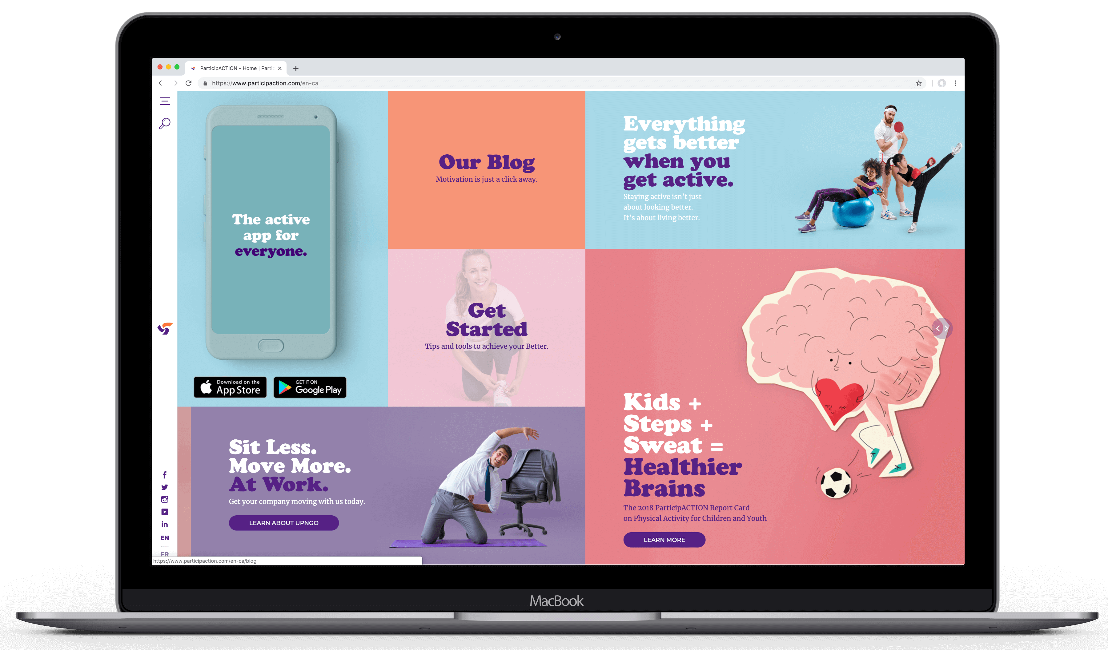
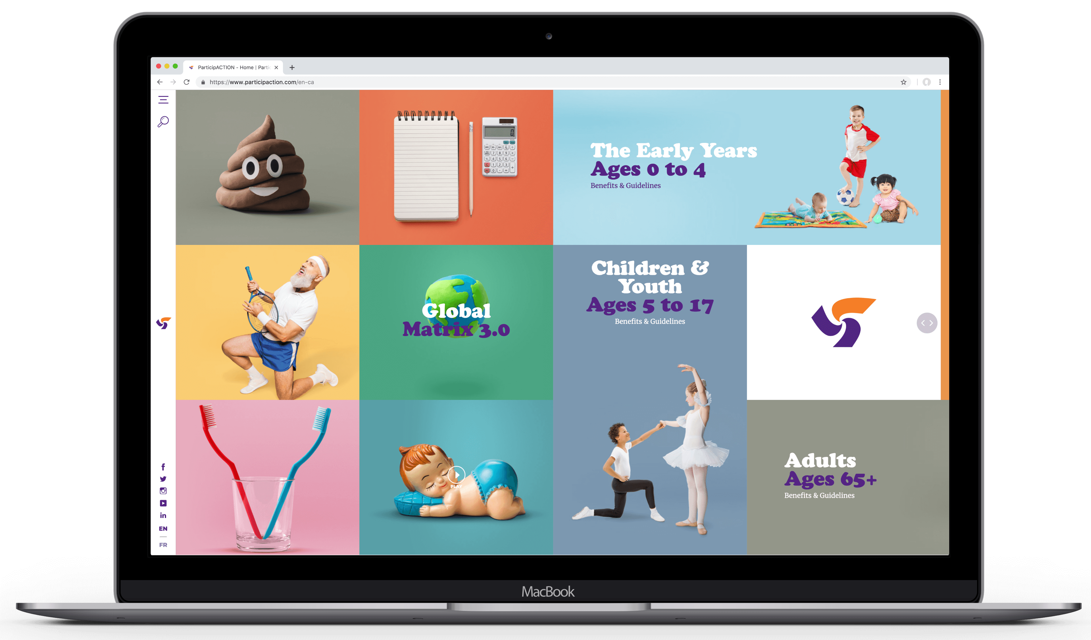
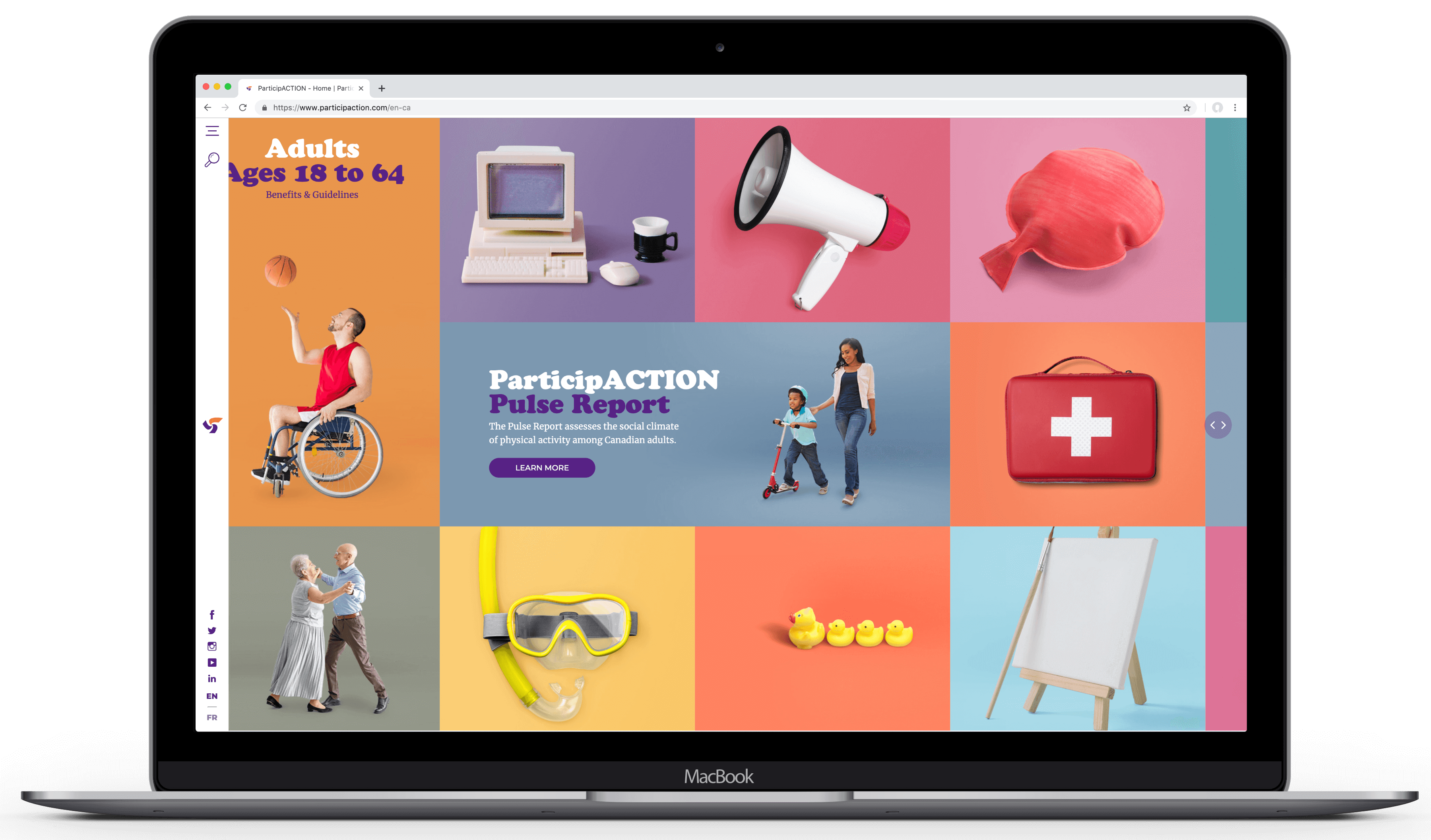
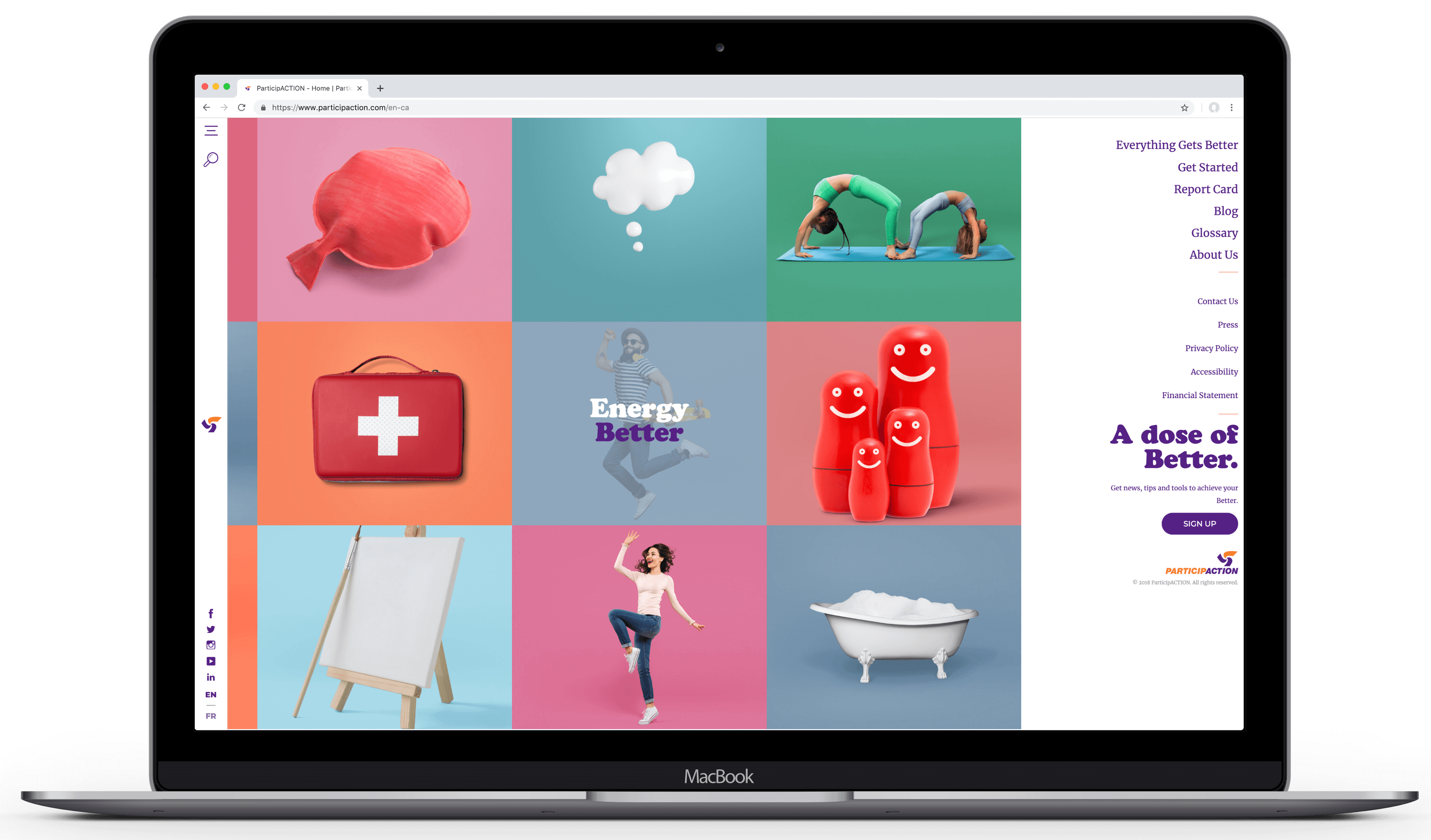
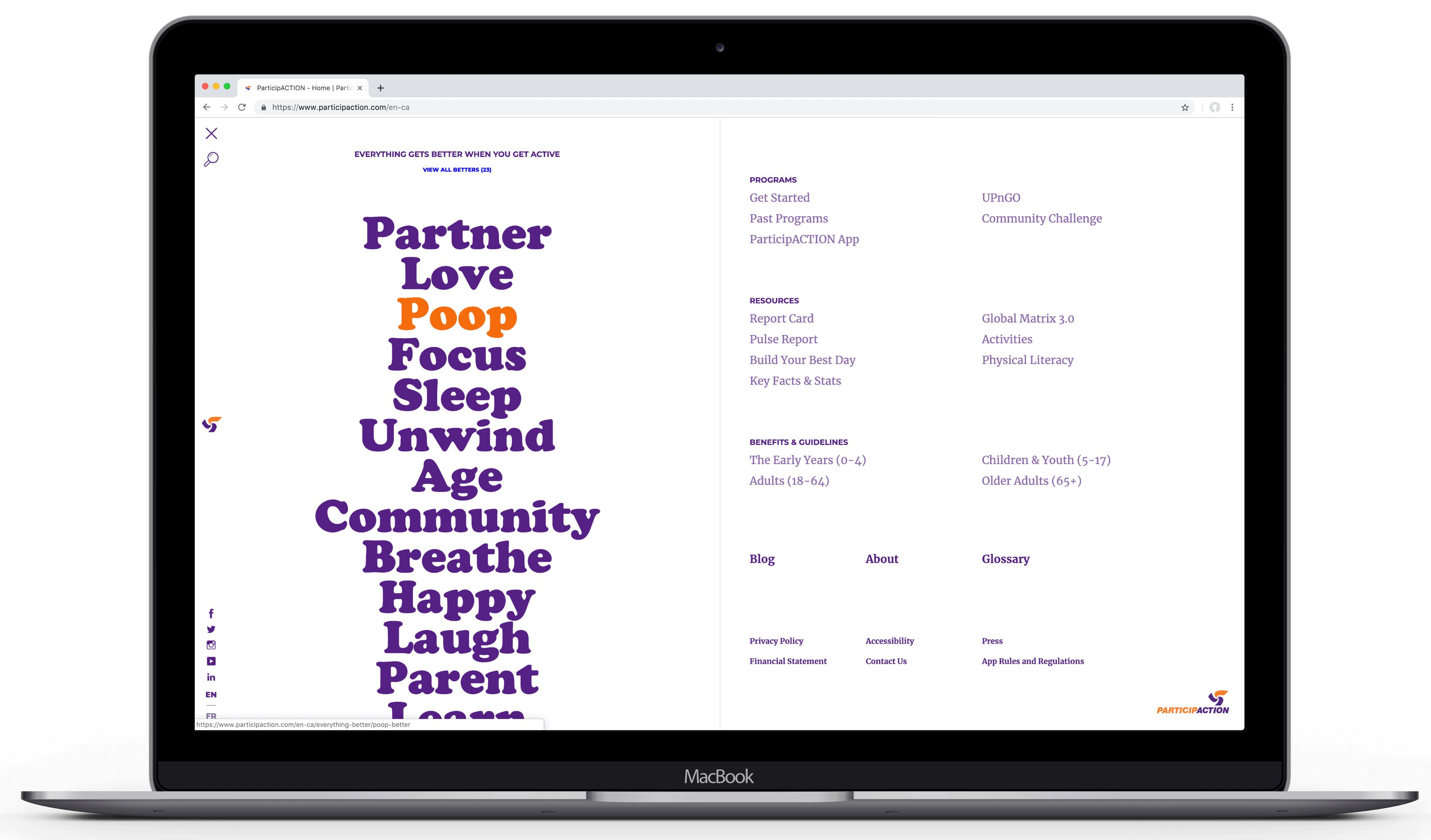
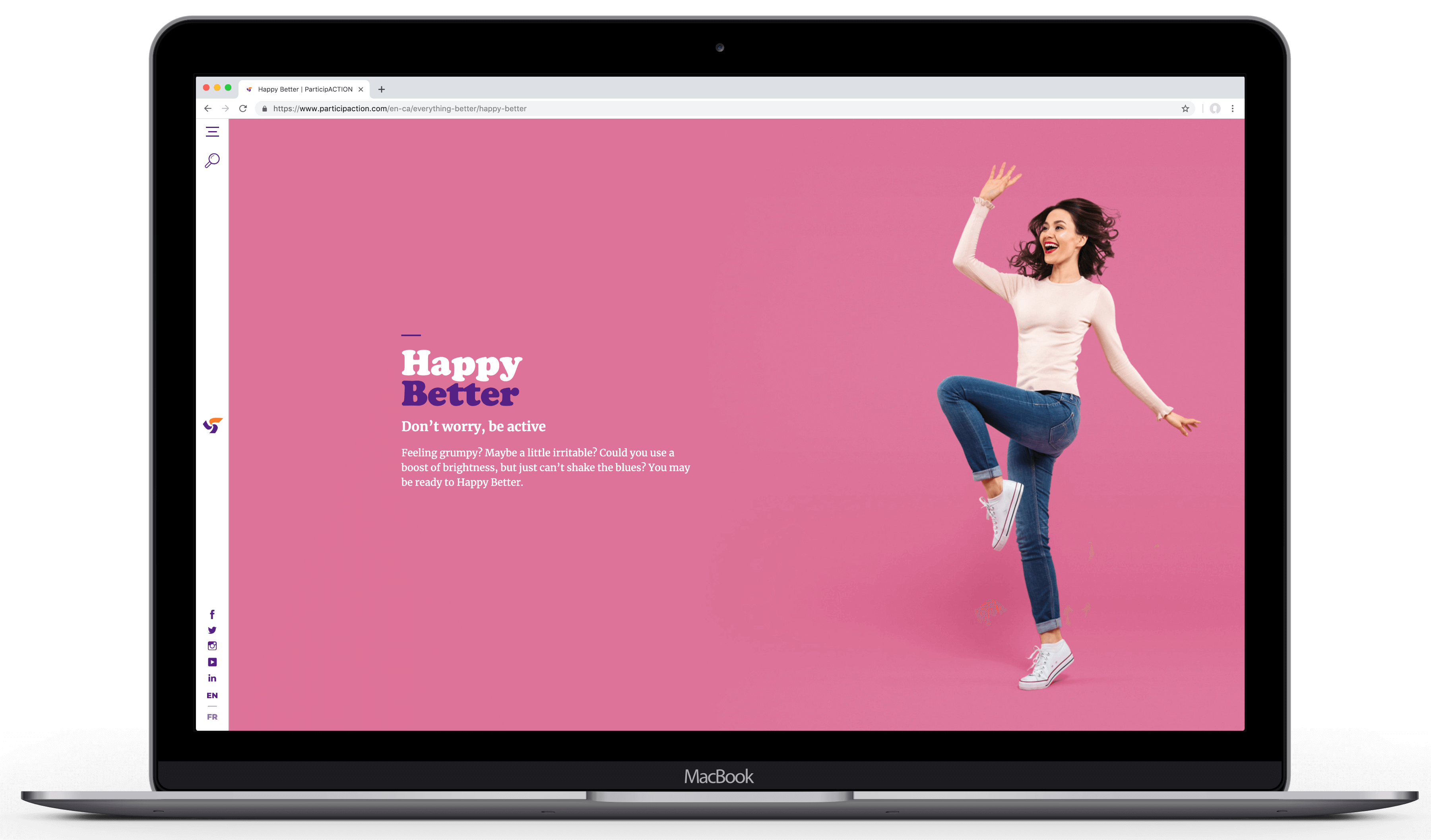
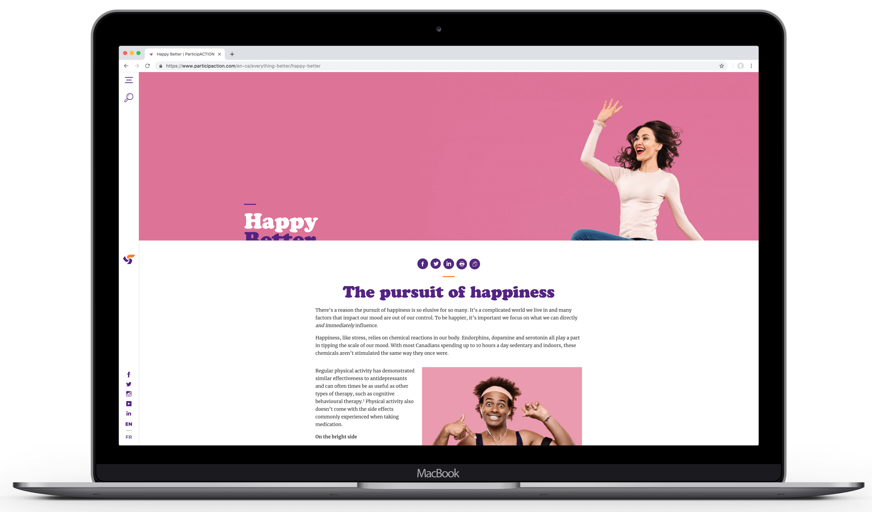
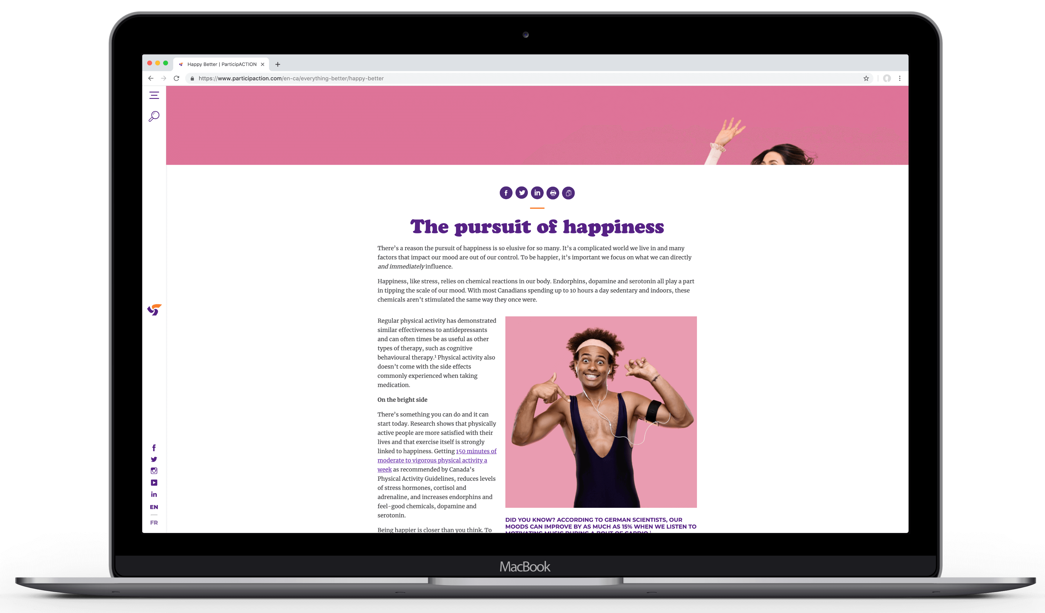
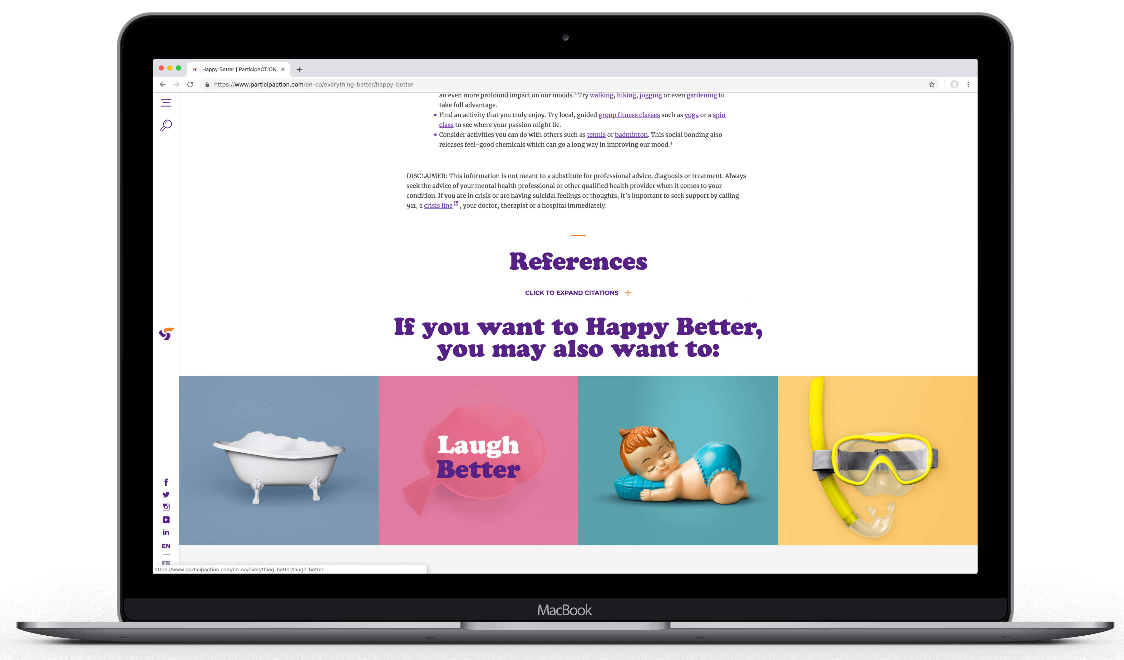
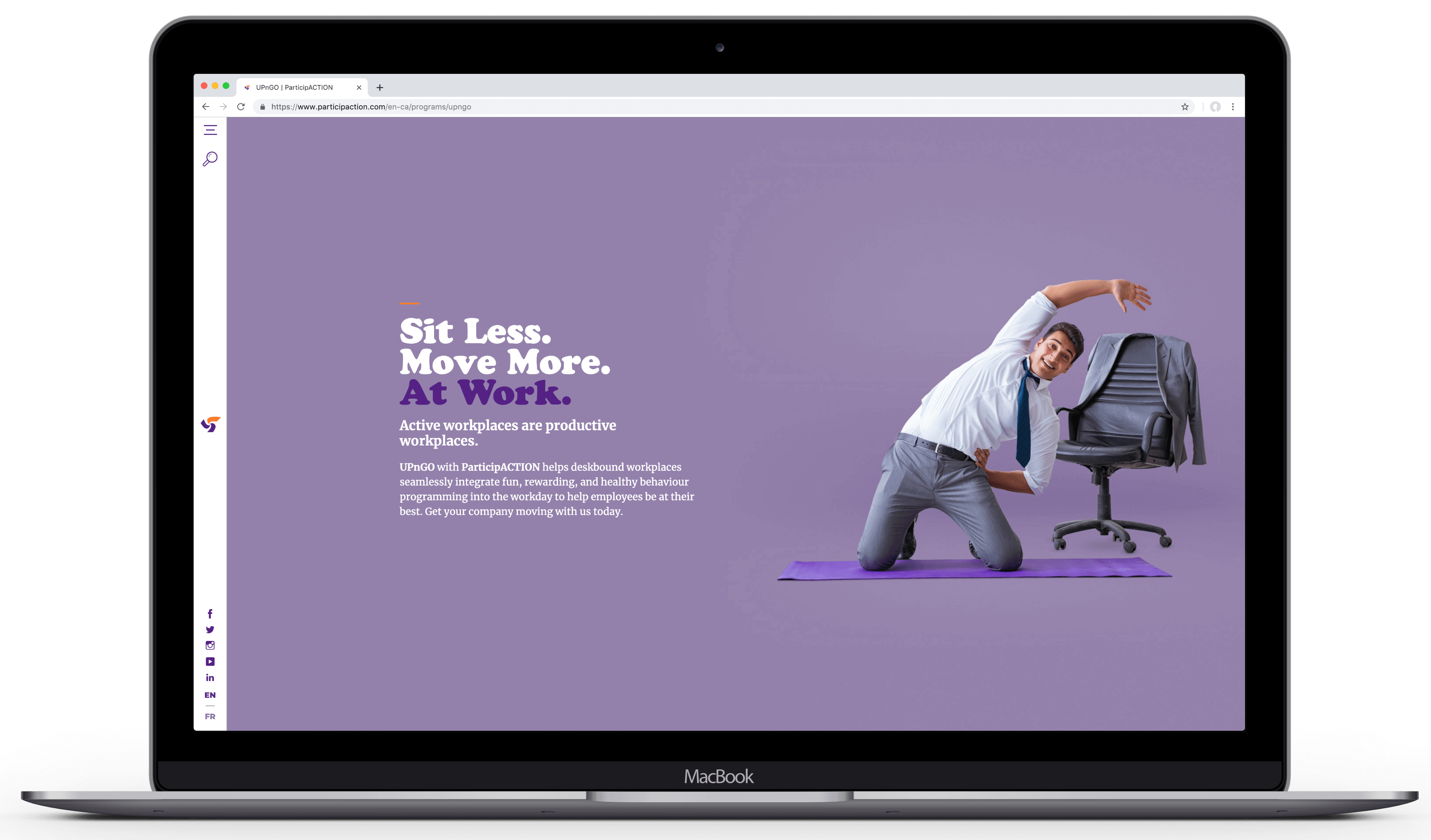
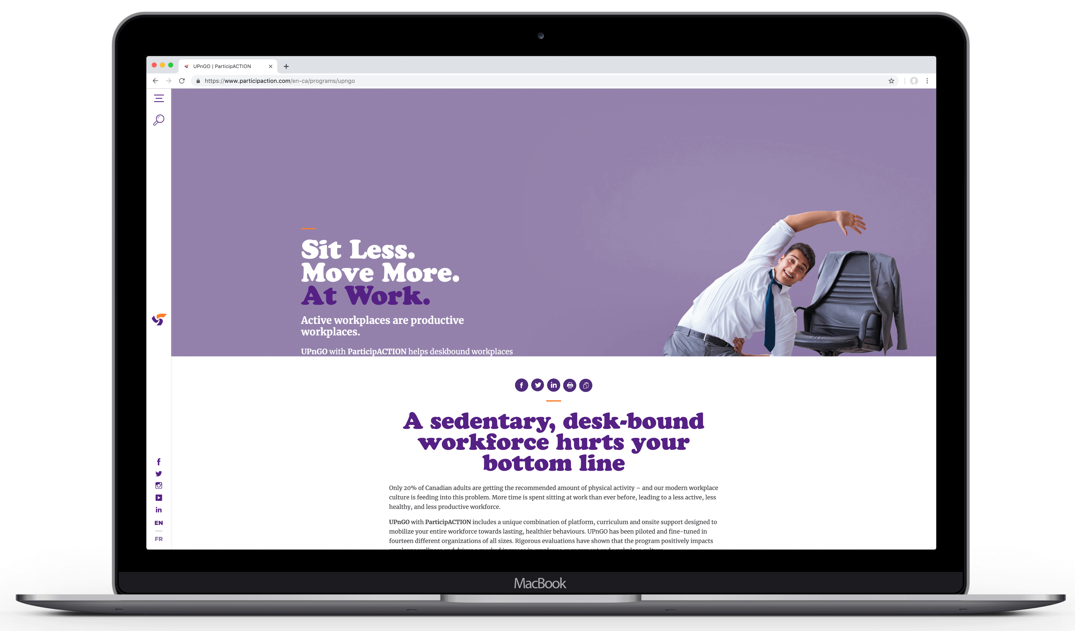
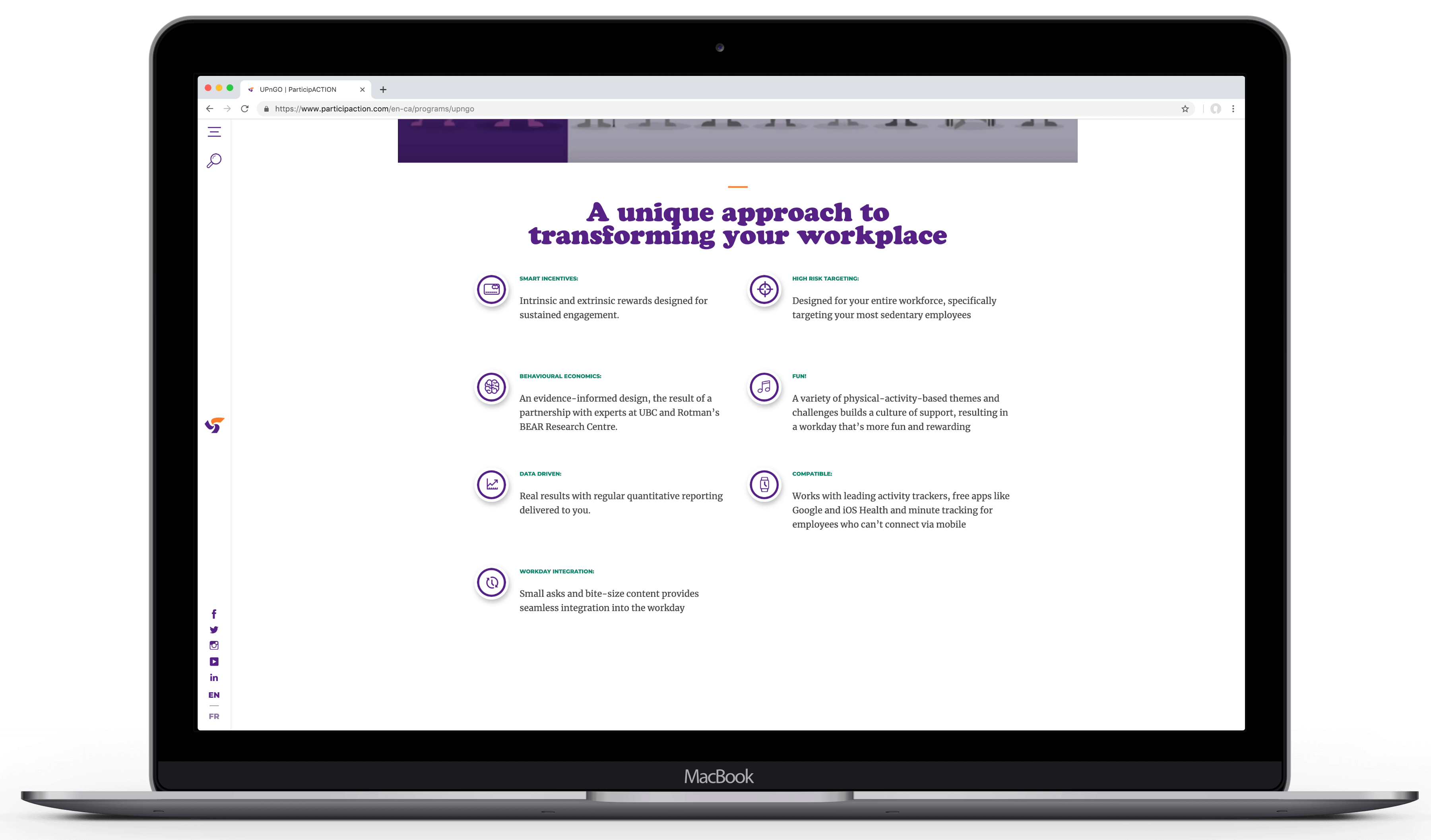
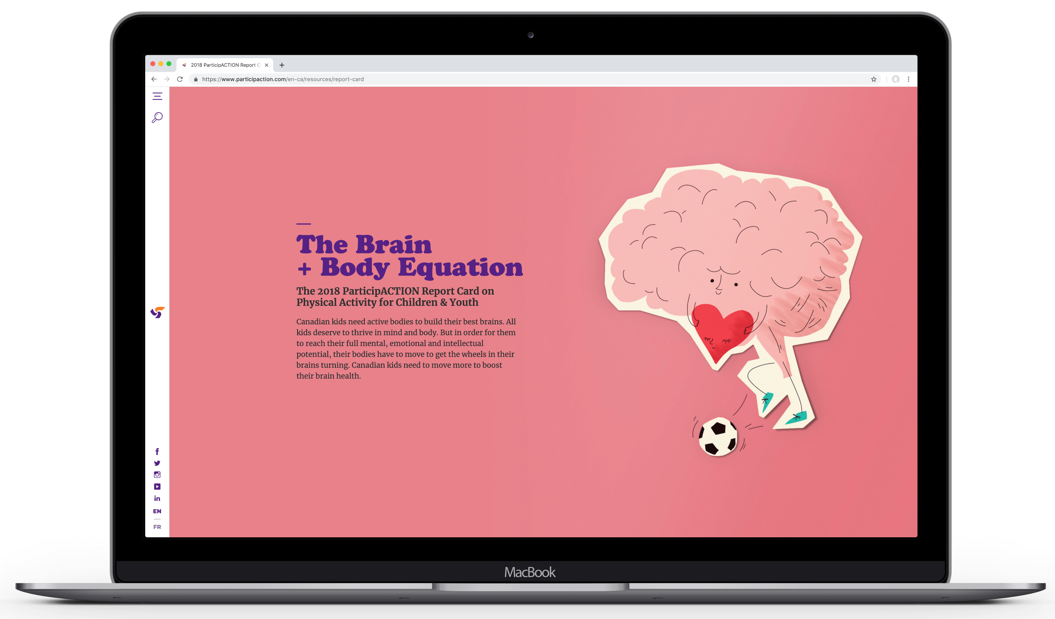
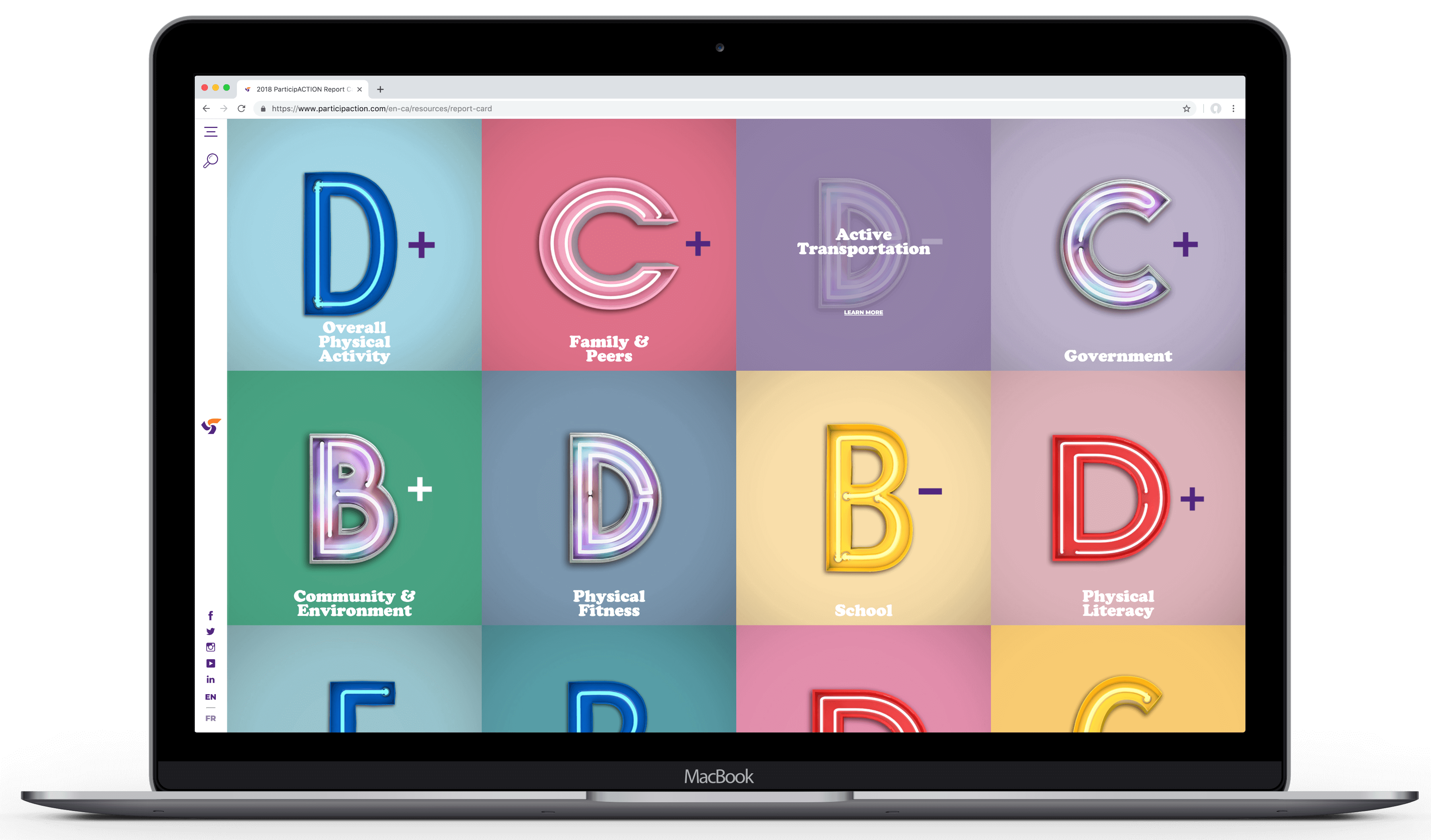
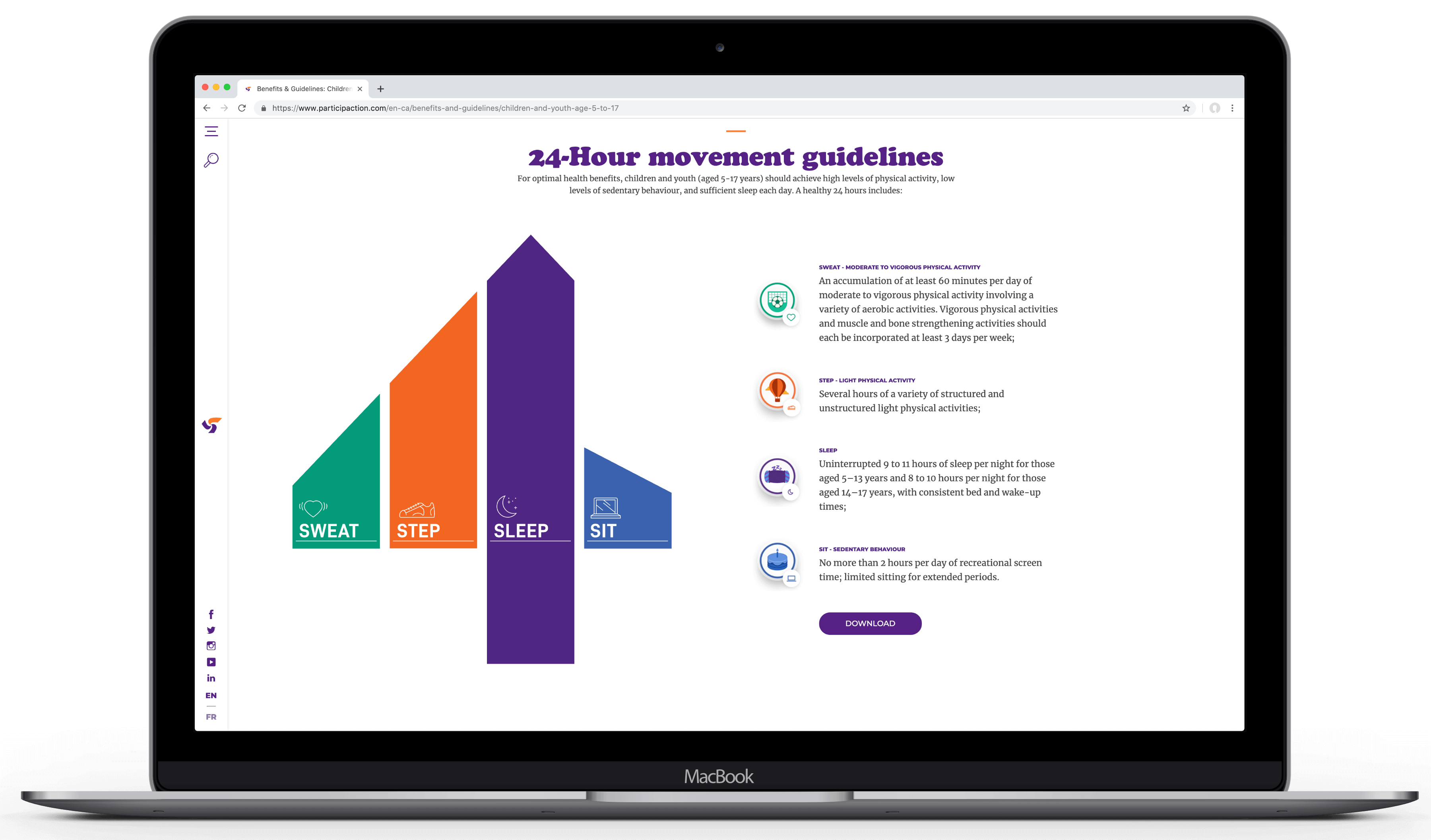
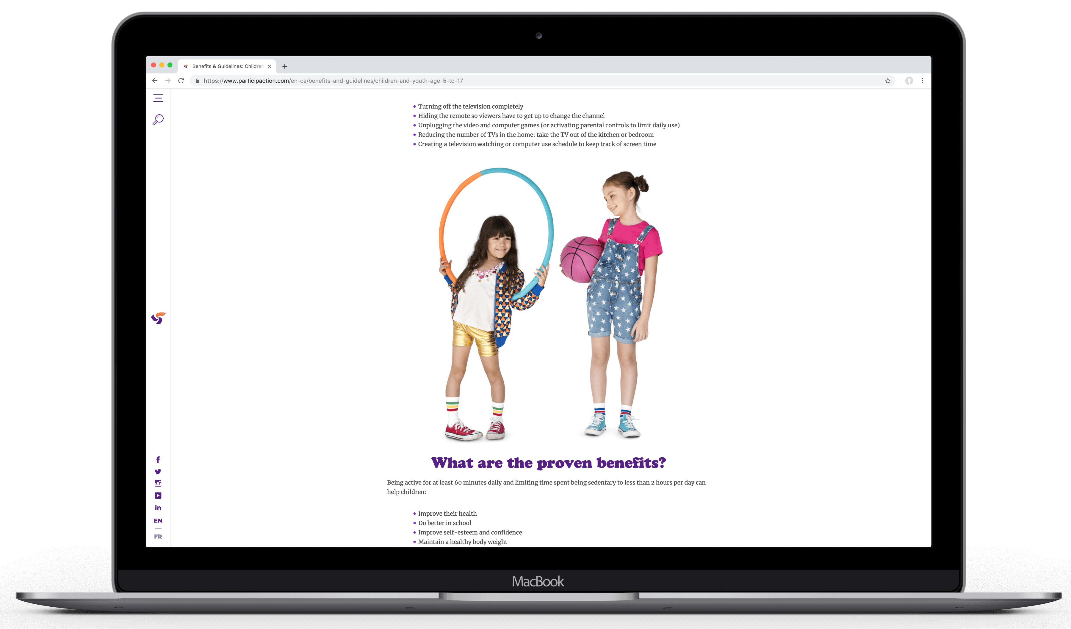
Copy for every page was researched and written from scratch or totally revamped under the lens of our new benefit-led platform, helping people understand the importance of each ‘better’ and what it takes to reach them.
Opportunities to move users from learning to doing were designed to let each user find their ‘better’ without the need for search. And each ‘better’ seamlessly connects to related ‘betters’ or information about real activities to encourage further engagement and time spent.
More Work
© Copyright 2023, Jonathan Webber. All rights reserved.
